Unit 2: The Externally Set Task
|
|
|
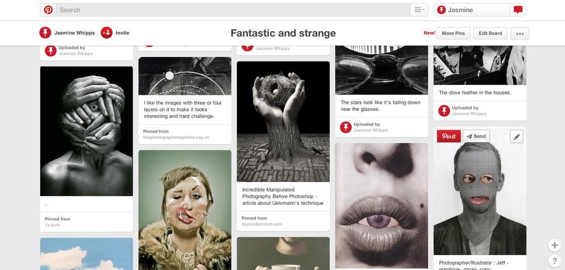
Here my Pinterest, have a look at my ideas for Fantastic and strange.
Fantastic and strange
Many photographers and filmmakers create fantastic and strange images. Mari Mahr and Jerry Uelsmann made surreal images using double exposure and overprinting. Most recently, Igor Morski used digital technology to produce surreal images for his graphic products, and Penny Jensz uses mixed media with photographers to create fantastic and strange portraits. In ' A Game with Stones ' by Jan Svankmajer and 'Canon' by Norman McLauren, a stop-frame animation is combined with film to produce fantastic and strange sequences. I have chosen this theme because it is interesting and I like a hard challenge, I want to try different styles.
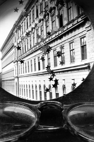
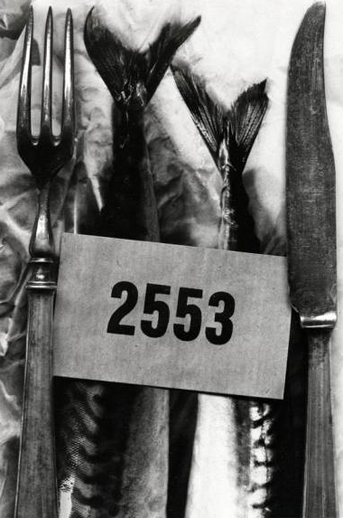
Mari Mahr

Jerry Uelsmann
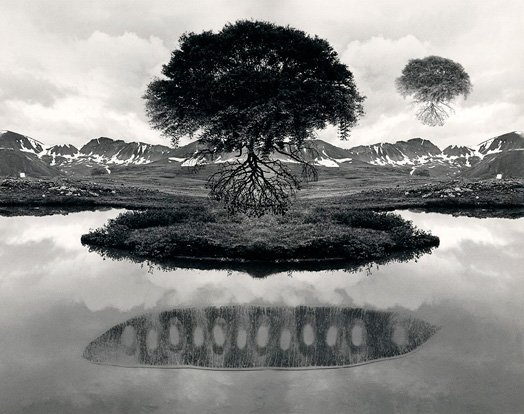
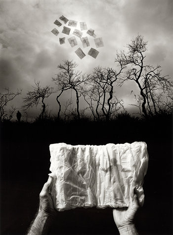

Mari Mahr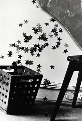
Evaluation
Mari Mahr's work uses a very 'magic realist' style in her Photography. She uses personal and cultural influences to make her photos. She normally uses a collection of black and white images. She collects lots of different images of different things and puts them together to be photographed. She also uses constant visual narratives in her work. I like this image because it look like the stars have been poured in the bin. I also don't like this one because it looks a bit old fashioned and not very inspiring. The objects were found and set up in a specific way,I think it shows that there are poor and rich people who live in her country. |
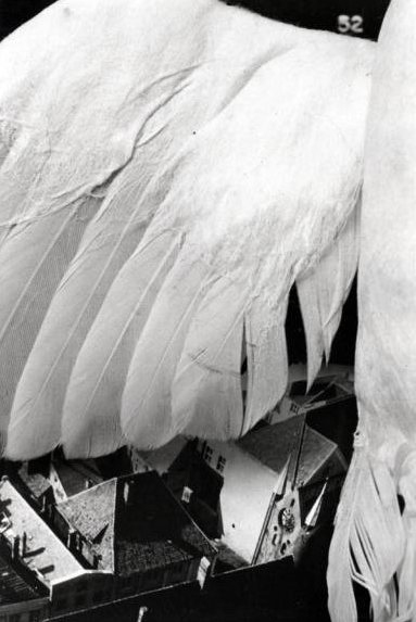
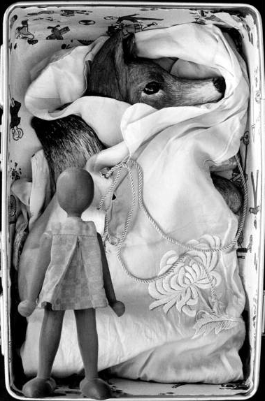
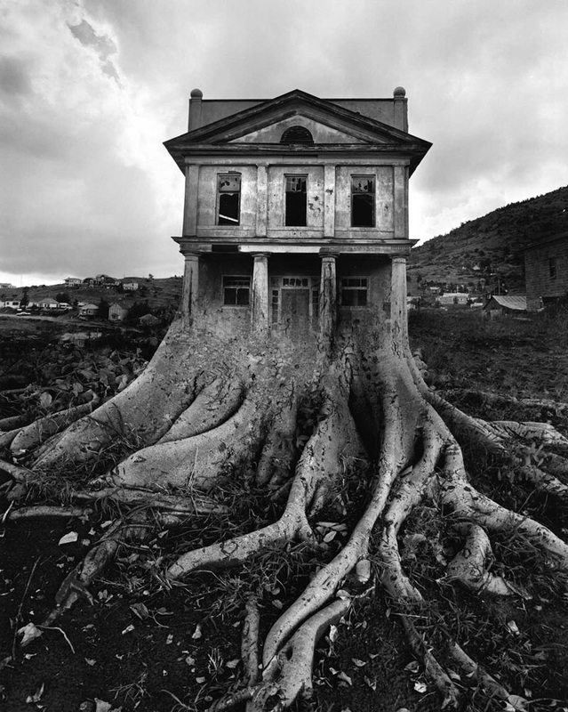
Jerry Uelsmann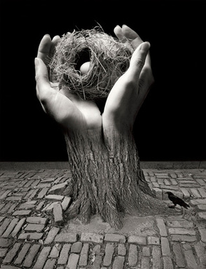
Evaluation
Jerry Uelsmann's made his work in the darkroom, There were four separate negatives, for example, the nest, hands, tree and bricks. These four images were put together to make an image. This image is surrealism because it is not the real world. Normally the photos show a window in the real world from imagination. I like this image because it looks fun and interesting, also this image is my type because it looks like the egg and nest are in a tree. I will defiantly make this style for my project. Uelsmann was an American Photographer and is a master printer, he made specific images with multiple negatives in the darkroom. He experimented with lots of different images to see which worked best together. |
Image analysis
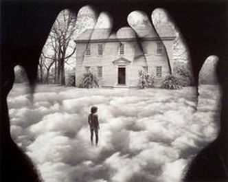
|
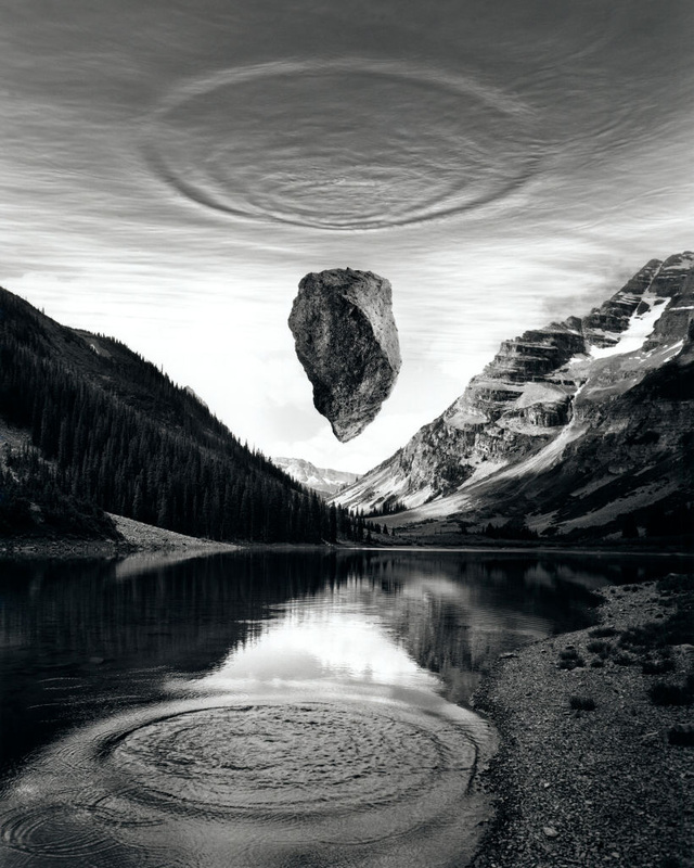
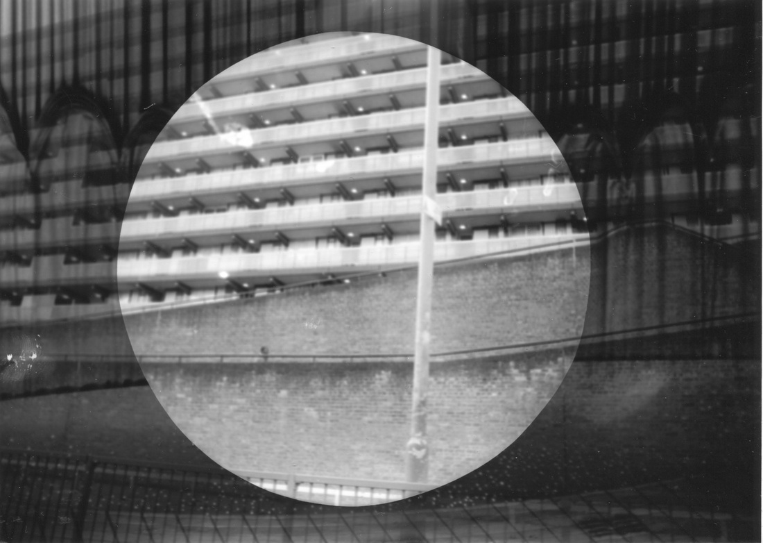
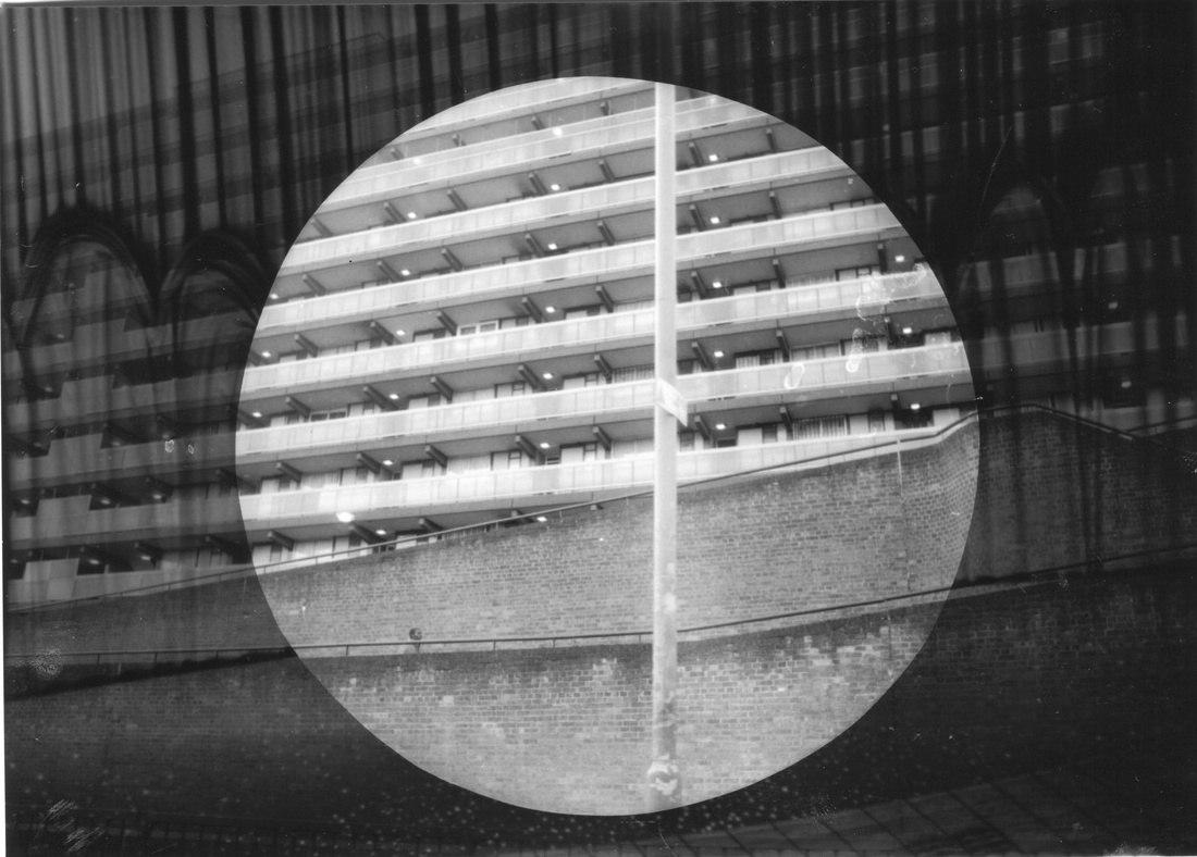
This is a Jerry Uelsmann's Photograph. Jerry Uelsmann made a Black and White image. This image is surprising and strange because the normal image shows real life but this image looks different because things are in the wrong place. For example, the boy and a house with the tree next to it are on the cloud but it is impossible to stand on the cloud. The normal image shows real life events but his style is different and like surrealism. Not showing reality. This image is calm, it looks like a dream.
I think this image looks like a boy that is in his dream. He stands on the cloud and walks to the big house. Maybe he is lost. The photographer shows his thoughts through the hands, portraying what is in his mind. Forty years ago, Jerry Uelsmann was an avant-grade photographer, he used multiple negatives in a darkroom. Today Jerry Uelsmann prefers a more traditional style of Photography using the darkroom rather than computer programs like Photoshop. |
Jerry Uelsmann's style in Photoshop
Here is a video of Jerry Uelsmann's style in Photoshop to show how you can make this.
First set of photos
Photoshop cropping and blending in the style of Jerry Uelsmann
How to make Jerry Uelsmann's style in Photoshop
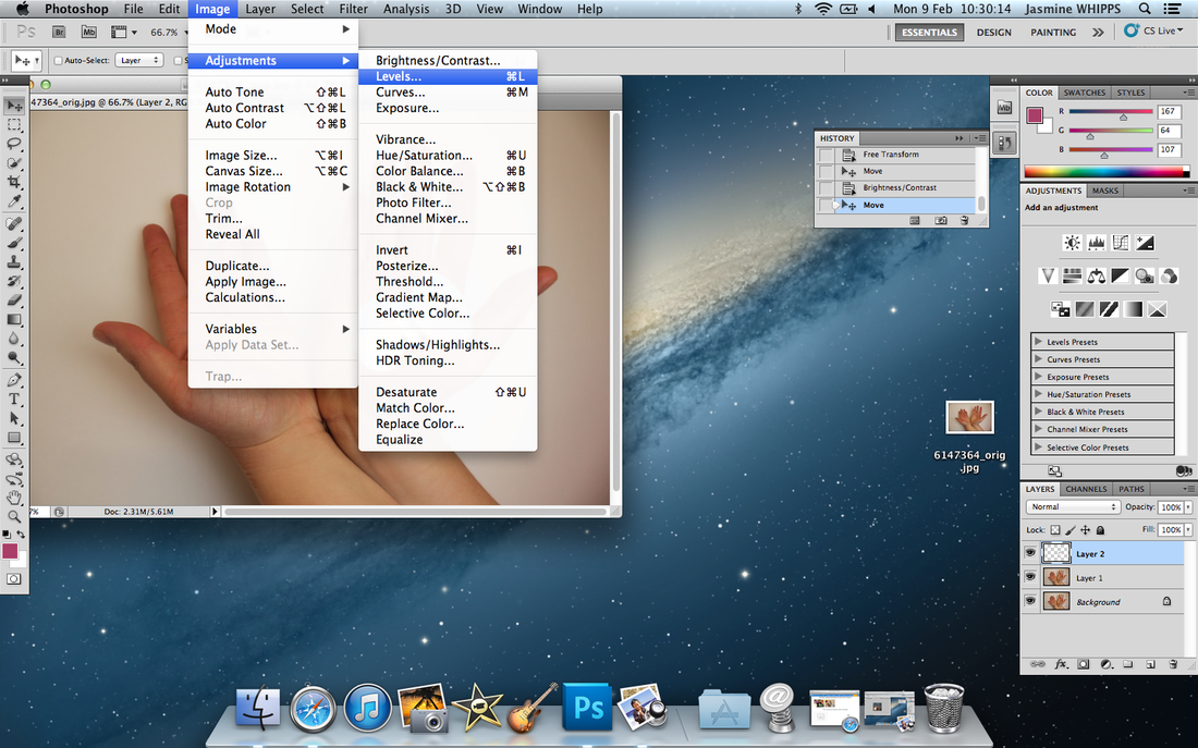
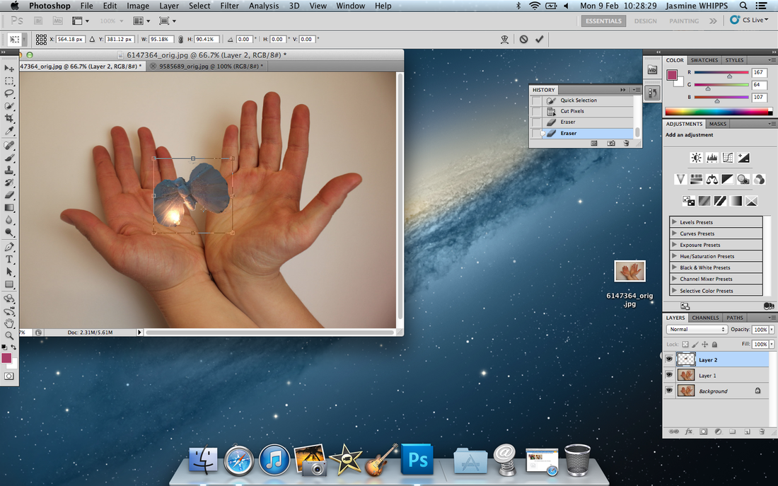
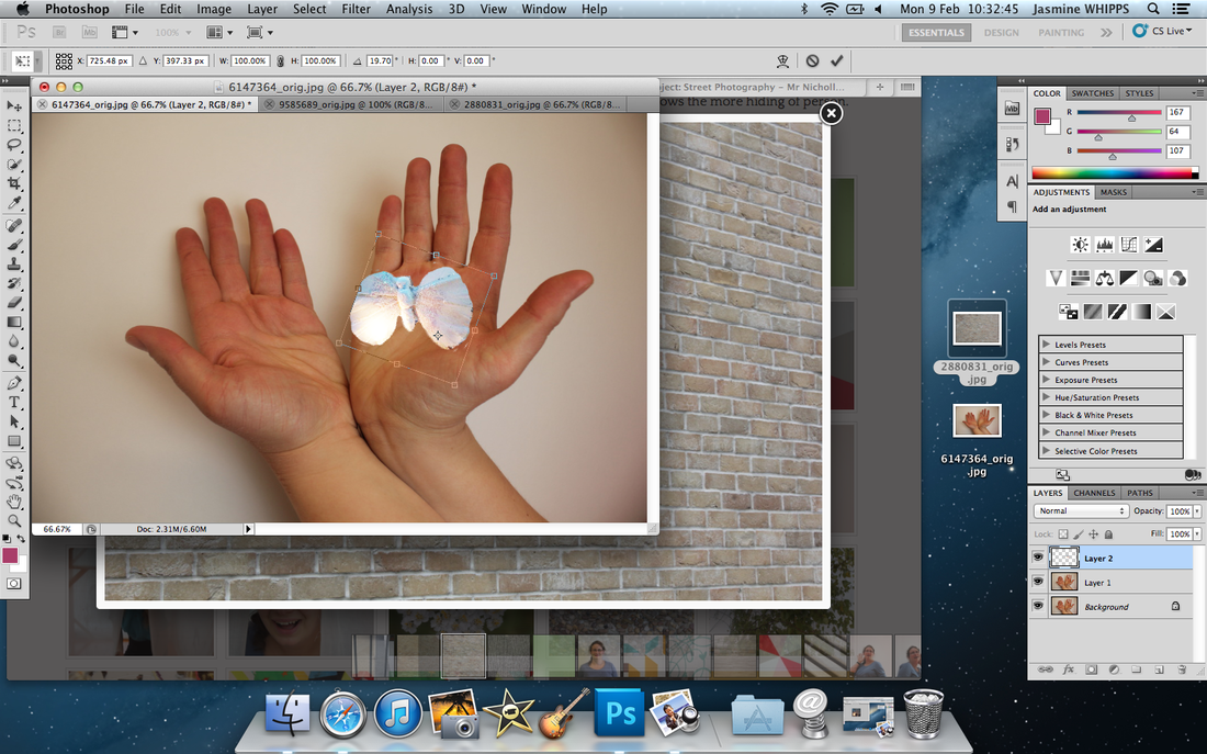
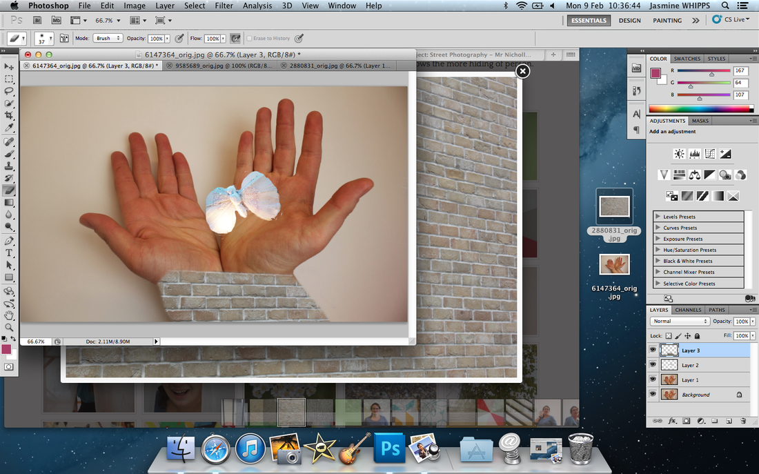
First, you choose the images and put them into Photoshop. You click on the images and adjustments - vibrance - flip it. If you want to rub out some of the picture around the image that you don't want, click the rubber icon and put it in small size to rub parts out. Then copy and paste on a different image what you want to put on it. Change the opacity (how to see through), move the image to the right place. Resize the image to a size you like, then draw around the area you want to select, modify - feather. Then add layer mask - rub out parts you don't want. Finally, opacity the image - 100%.
Evaluation
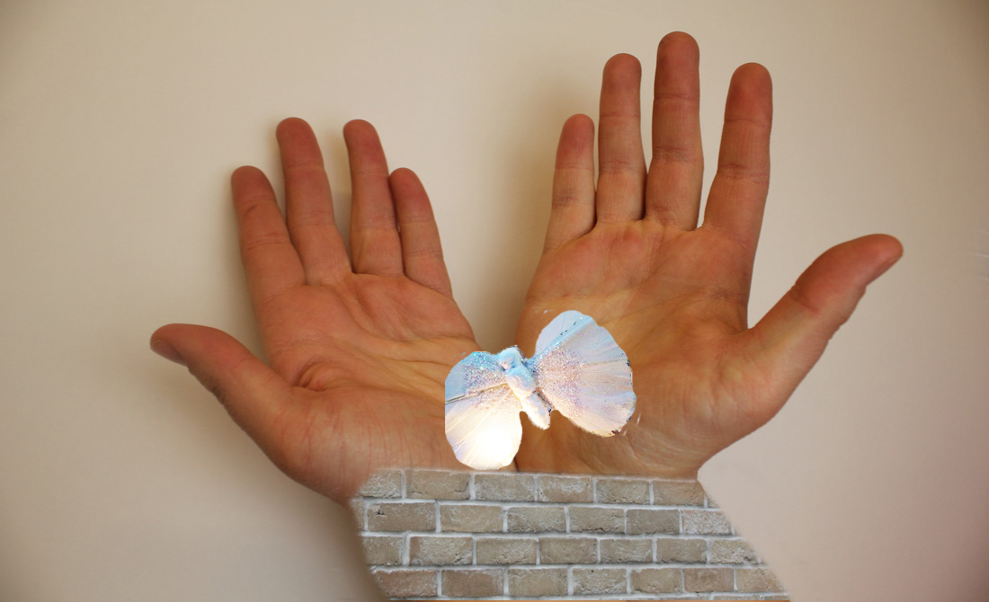
EvaluationI quite like this image but I don't like the image in colour. This is because the colour makes the hands and 'arms' look separate, they have not blended as well as the Black and White image. The colour image is strange because it is impossible to have arms that look like bricks.
|
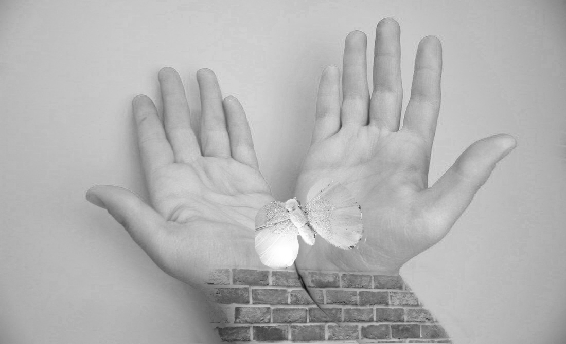
EvaluationI prefer this image because I like the Black and White image as it is like Jerry Uelsmann's style. Also I like the way the brick wall has blended with the arms. The butterfly is on the hand, sometimes it's impossible to have the butterfly on your hand because they normally fly away. I also think that the image being Black and White makes the picture look good.
|
Fantastic and Strange mind map
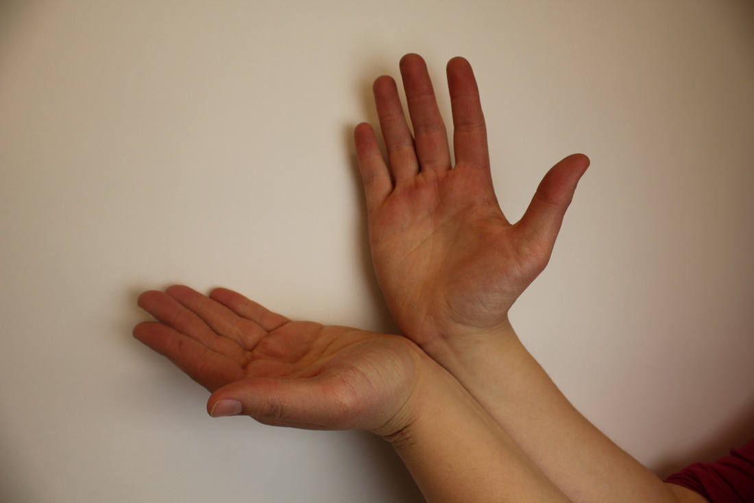
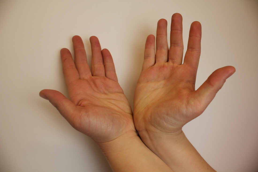
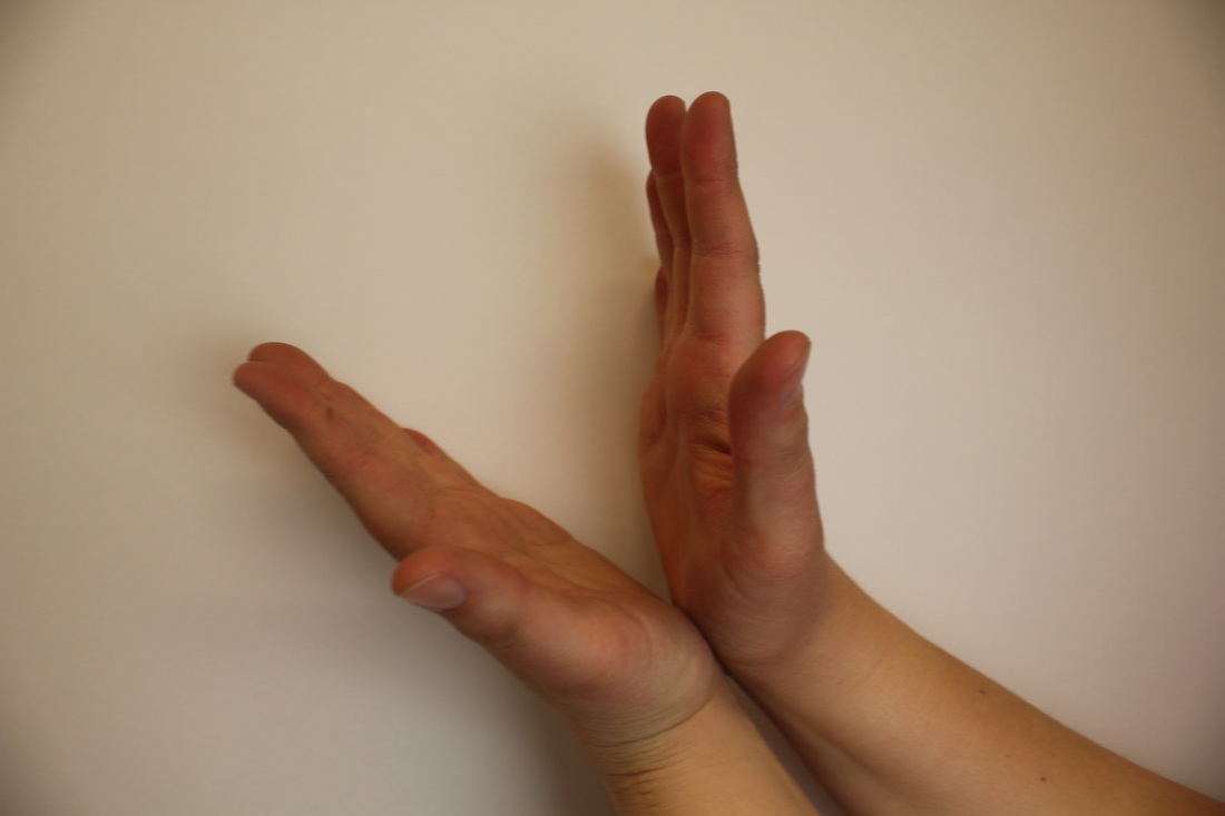
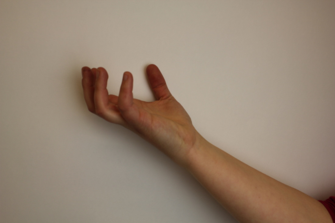
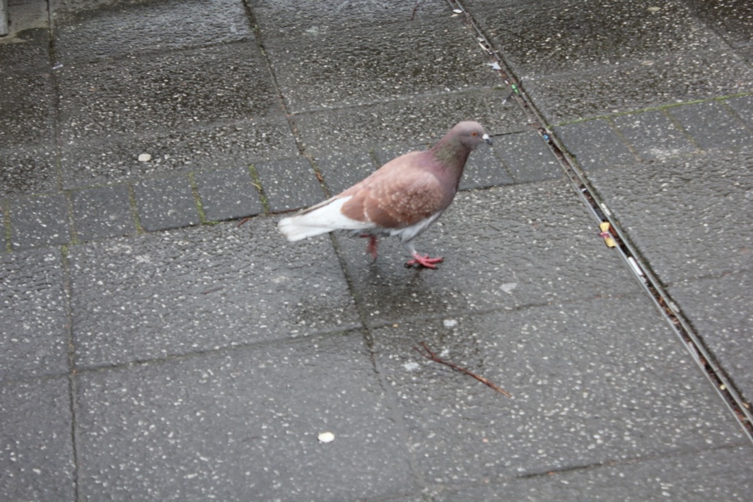
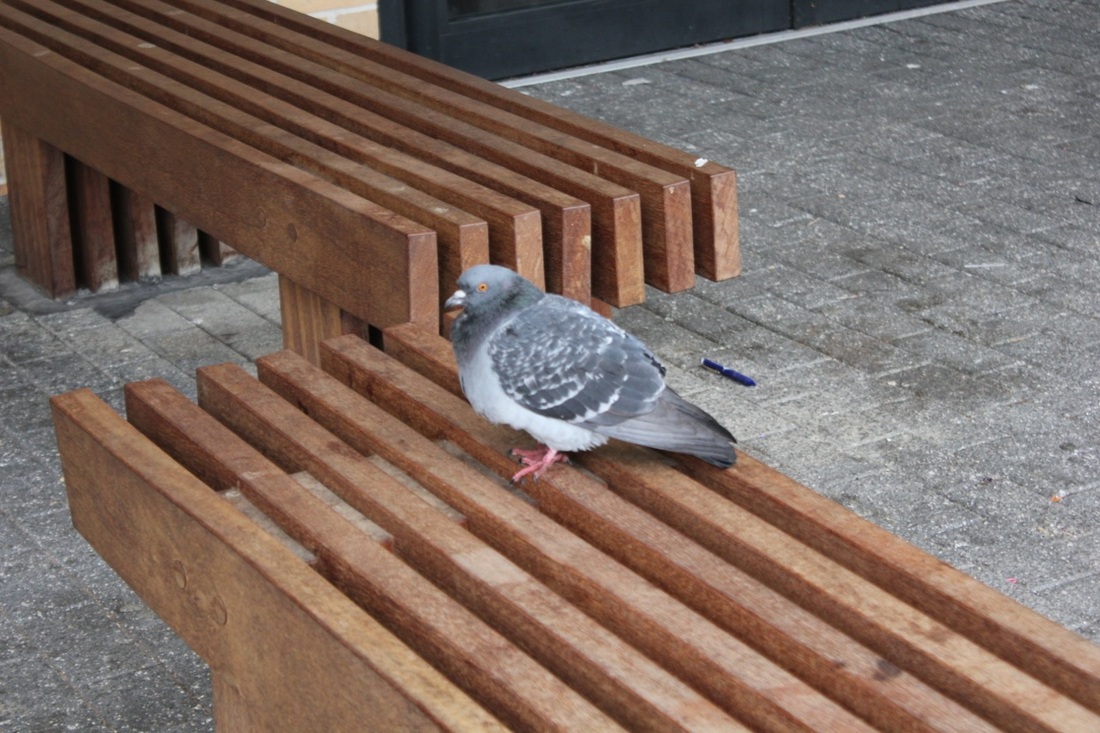
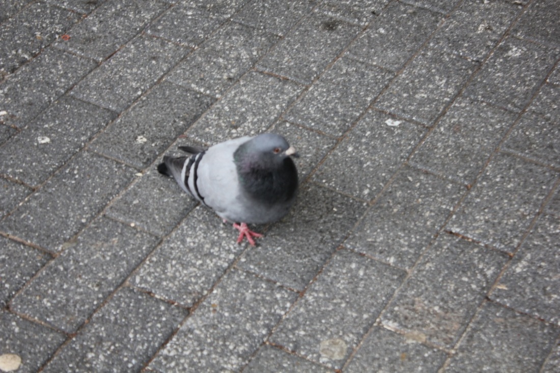
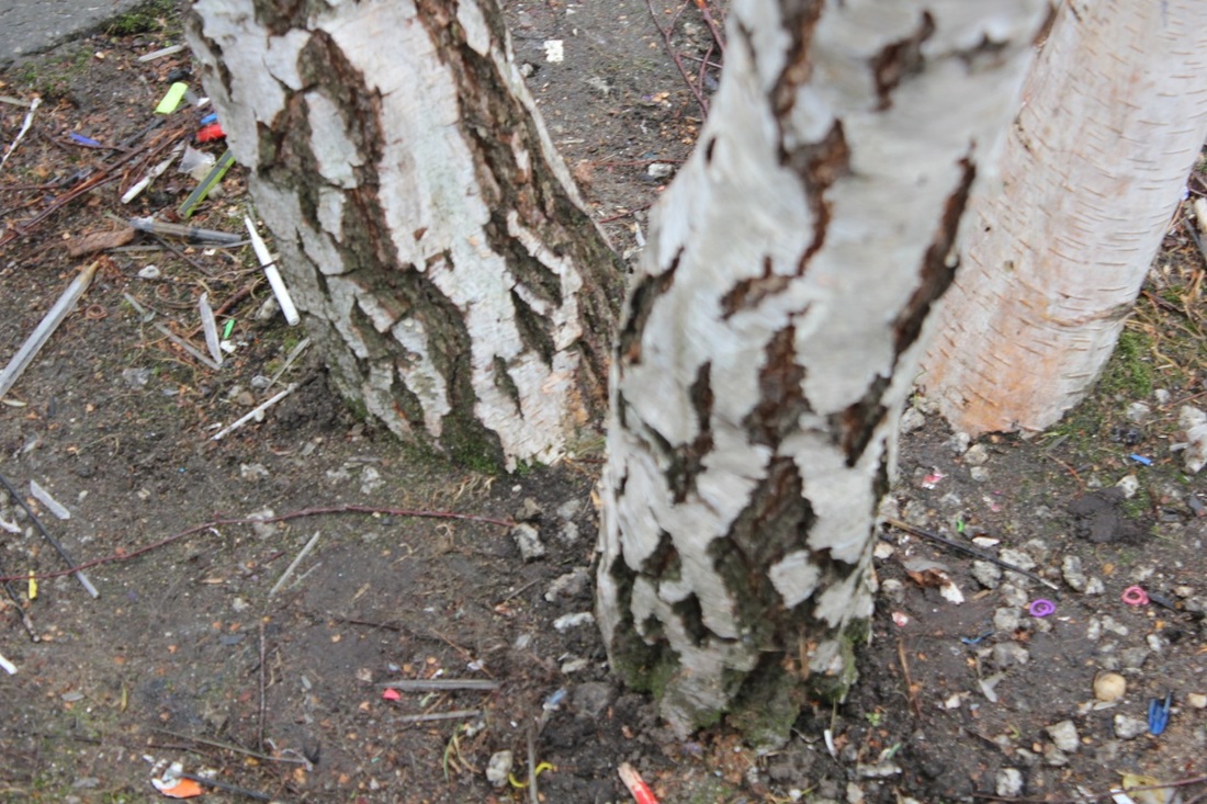
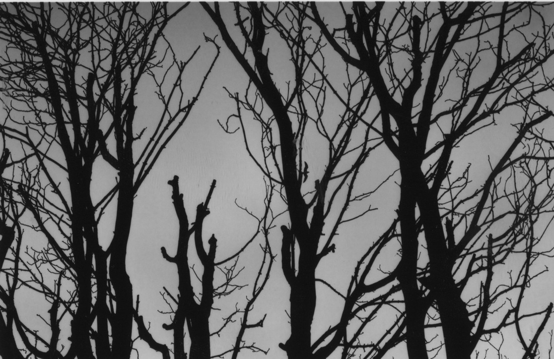
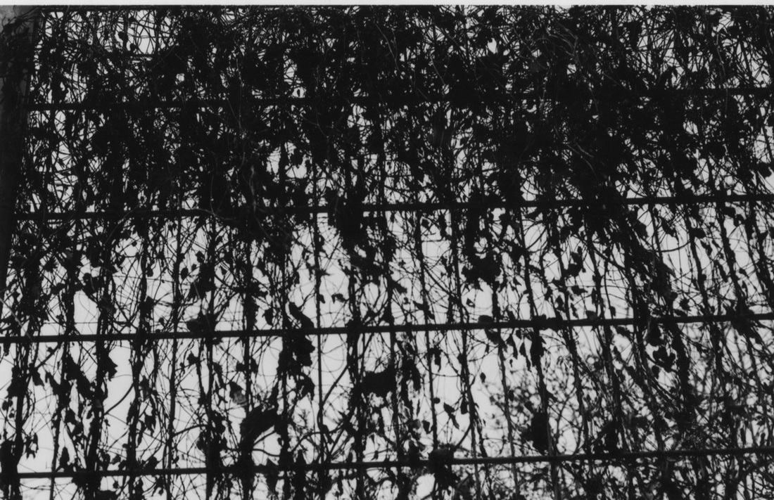
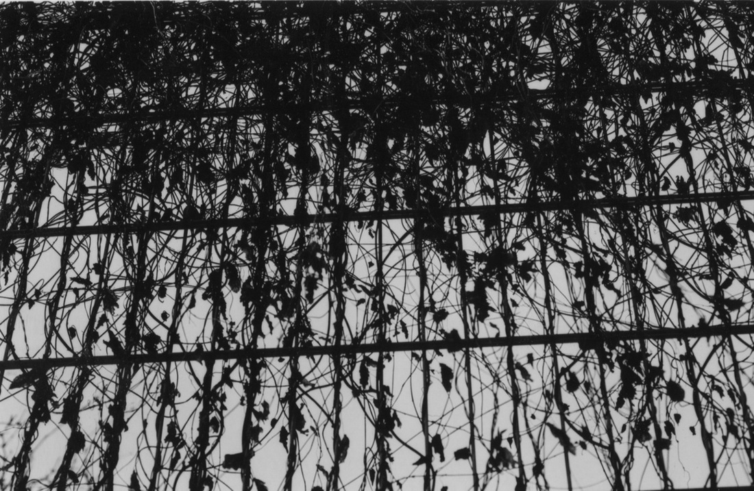
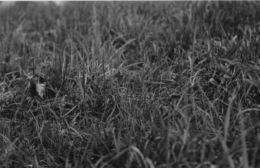
Images taken during the half term
Double and Multiple exposure using negatives in the darkroom
Here is a video that shows you how to make Double and Multiple exposures, using negatives in the darkroom. Take the photos using a Black and White camera with a negative film, then take the film out. Cut the two images you like then tape them on top of each other and leave it in enlarger's negatives holder where you put the negatives that you have chosen. Put the light sensitive paper on the mat and turn the light on for 10 seconds. Then turn the light off and develop the photos by putting the paper in Developer for one minute then place in the Stopper bath and then in the Fix bath. Finally the images are rinsed in water and hang up to dry.
Harry Callahan's style of Double and Multiple exposure
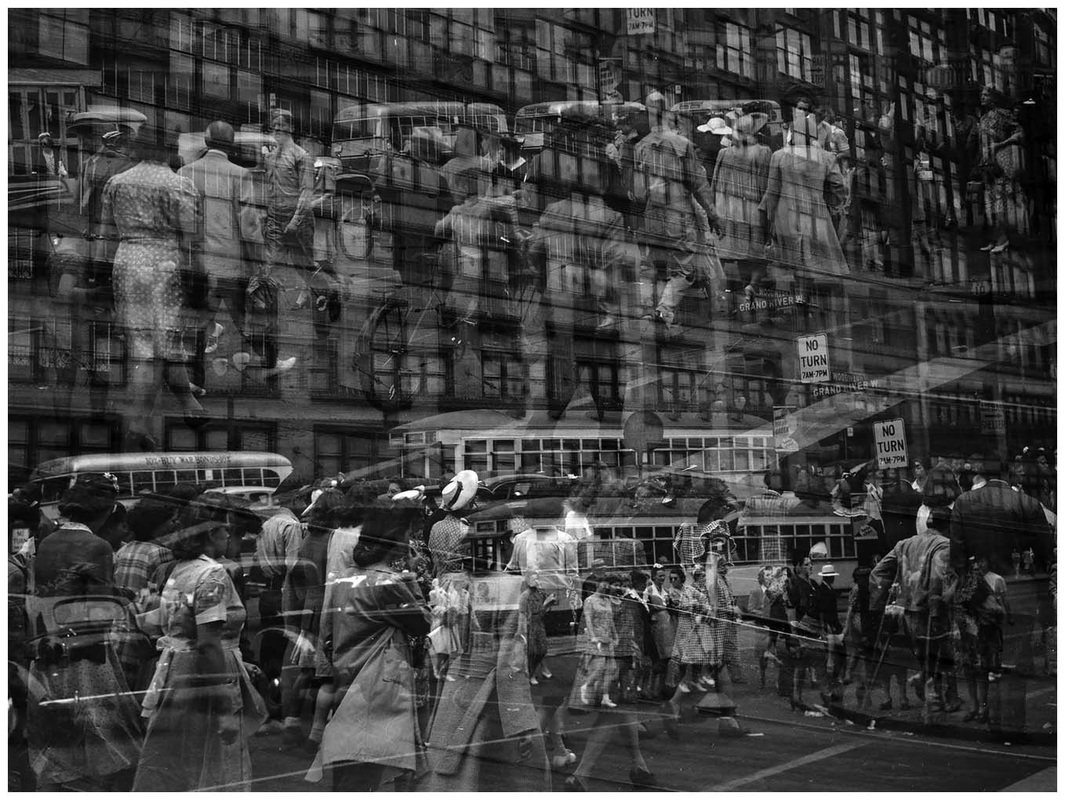
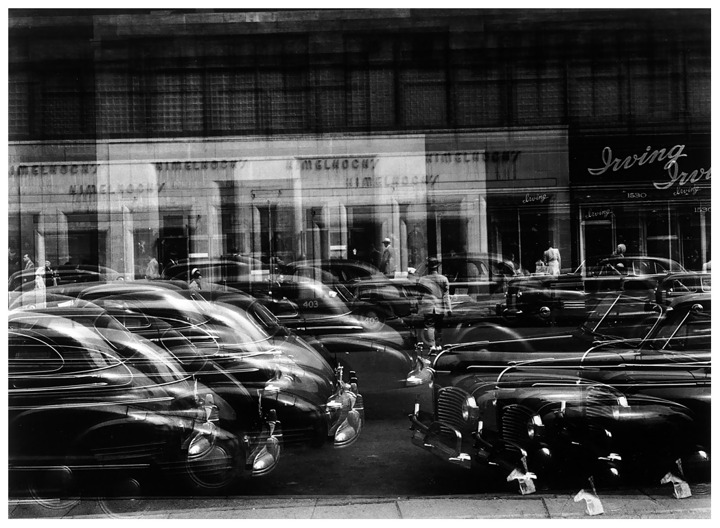
Harry Callahan made these images in the darkroom using different negatives that is put on top of each other to make a Double and Multiple exposure. Harry Callahan photographed his wife and daughter and the streets, scenes and buildings of cities where he lived, showing a strong sense of line and form, and light and darkness. He find the zone of images like brightness and darkness, then he picked two images that he liked and blended them.
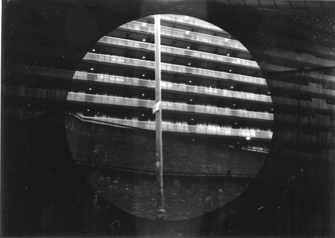
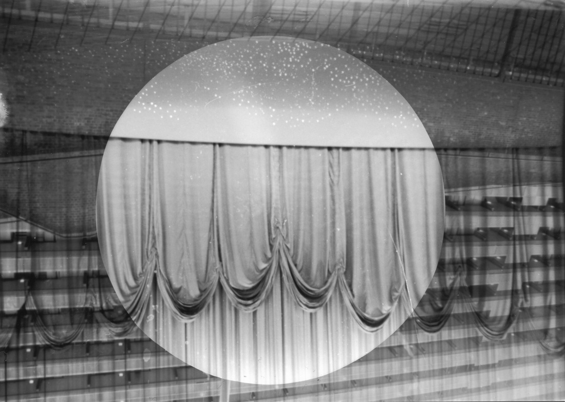
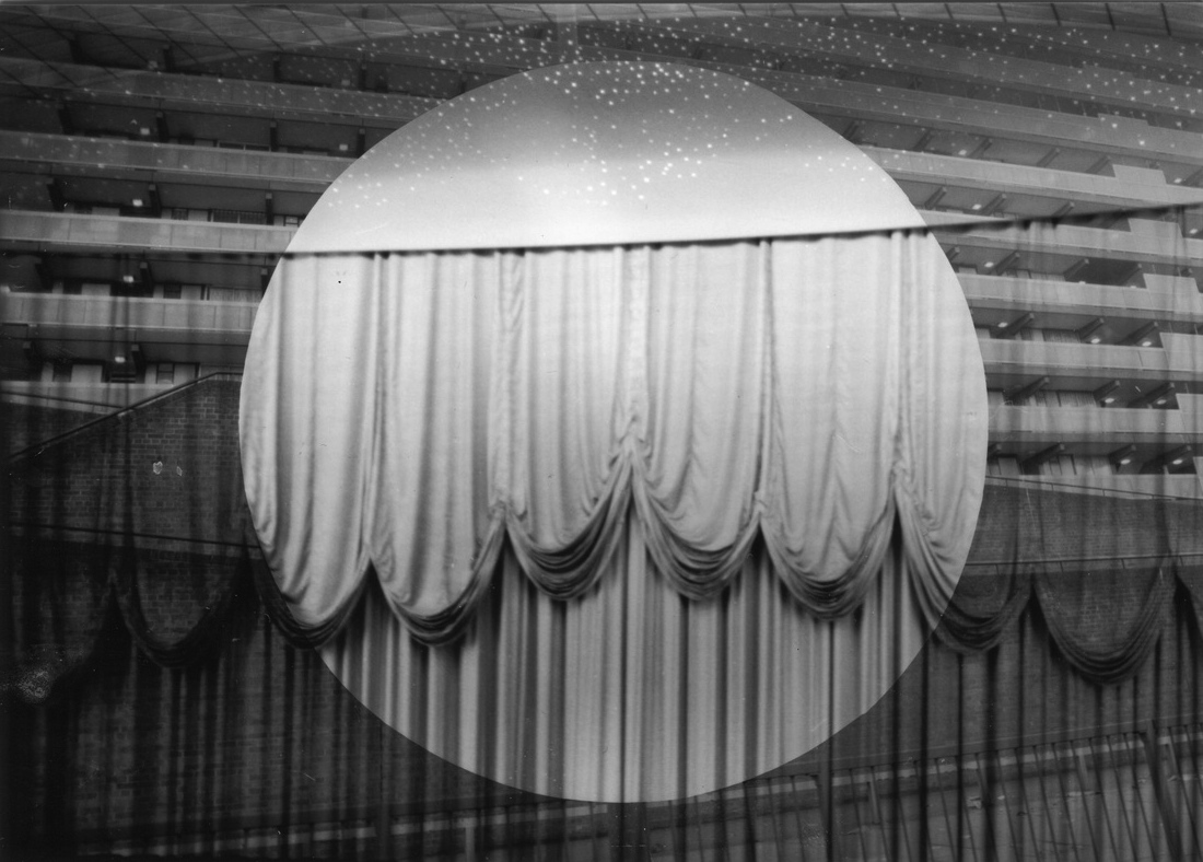
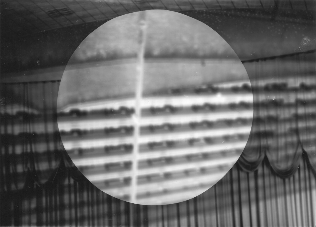
My Double exposure in the darkroom
Here are my Double exposures, I made these images in the darkroom using the negatives holder.
Experimenting with Double exposure images in Photoshop
Experimenting with Double exposure images in the darkroom
These are my double exposure images that I made using the darkroom. I mixed the chemicals in the dark room by firstly adding 100ml chemical and 900ml water for Developer, I then added water and 'Stop Bath'. Finally I added 200ml chemical and 800ml water for the Fix. I turned the main light off and worked in the room with the red light. I had the negatives with me and picked two images, I put it into the negatives holder. I put the sensitive paper on it with a cardboard circle in the middle. I turned the light on for 4 seconds then turned it off. I did the same thing with second negative image but without the cardboard circle. Then I put the sensitive paper into the chemicals.
|
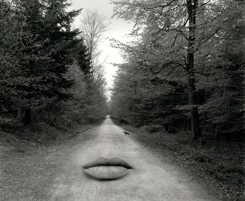
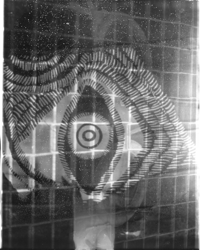
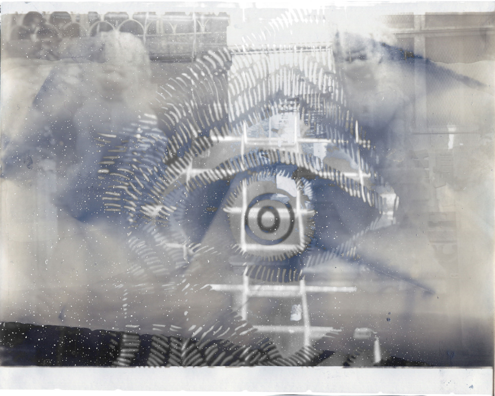
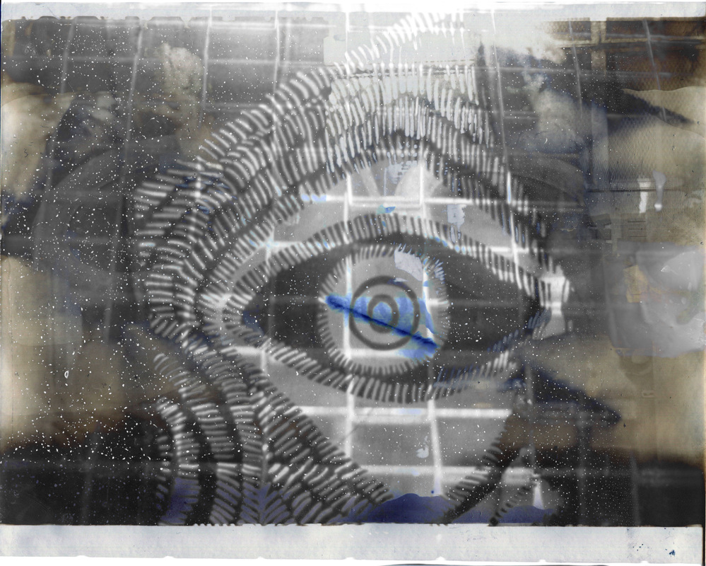
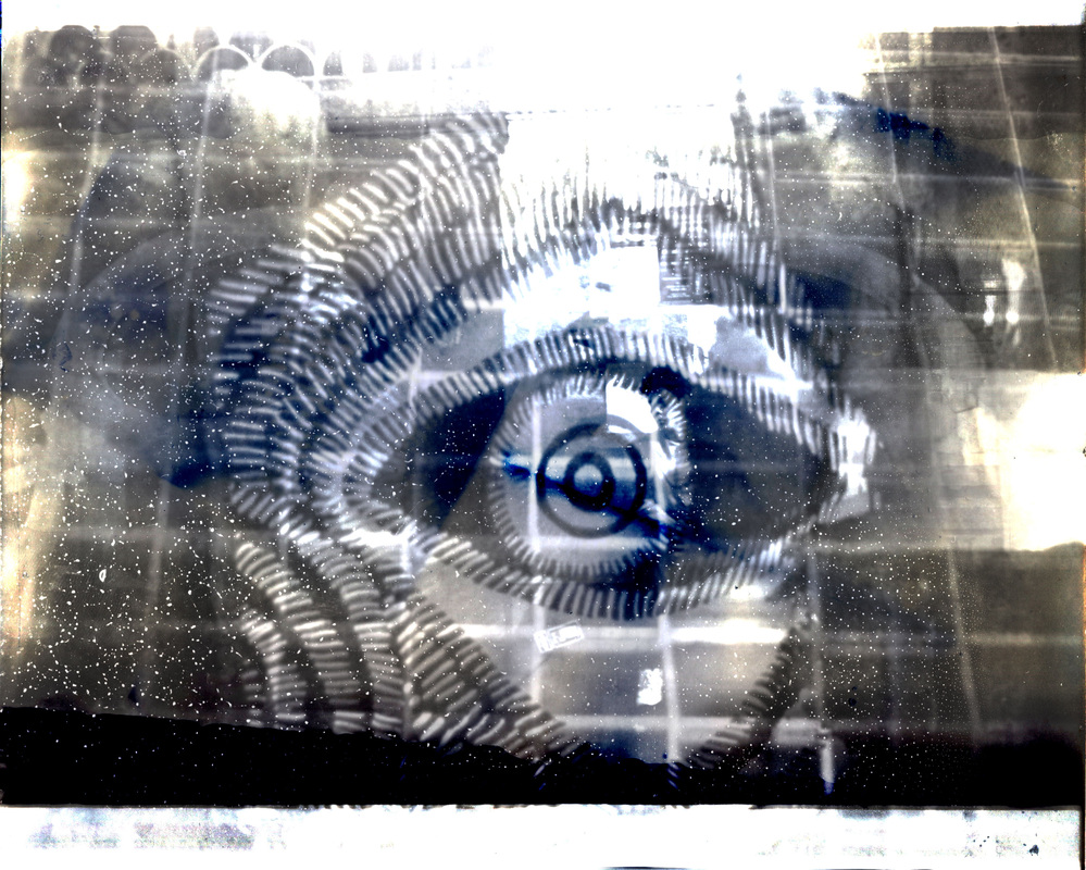
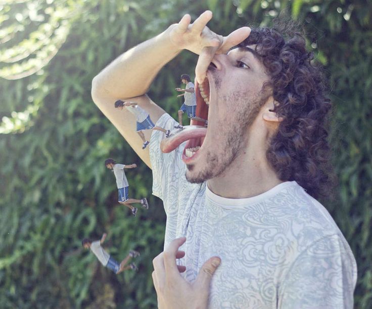
I think this image is awesome and fantastic due to it being strange. I like the way the little same men walk out of his mouth and try to escape, this makes the man seem as a giant with tiny brothers. I can recognise his mouth being as strong and tough as it takes to give birth. His tongue also is very long like as a dog. I think this image is abstract because it is not natural. This affects the way I look at it because I didn't expect people to make an image like that. This photographer reminds me of running away from someone. The colours and tones in this image are quite bright.
This image is much different from real life because the people can't have people in their mouth, they are too big to be in the mouth. The thing I like the most about this image is, the men try to escape from him. I would ask the artist if s/he were here, why those men tried to escape from him. I would give the title for this photograph 'Escape from him' If I was there, I would probably get excited to see the tiny men because we never see tiny humans as if they were a mouse before. I think the artist made this photograph by using Photoshop, the artist took photos of him running, jumping, walking, and standing with his mouth open. They then put it into the Photoshop and edited the human to made it look tiny, lengthening the tongue and mouth. This image doesn't have something fantastic or strange in the background. If I made something like this, I would add a strange background to make it look more interesting and complex. |
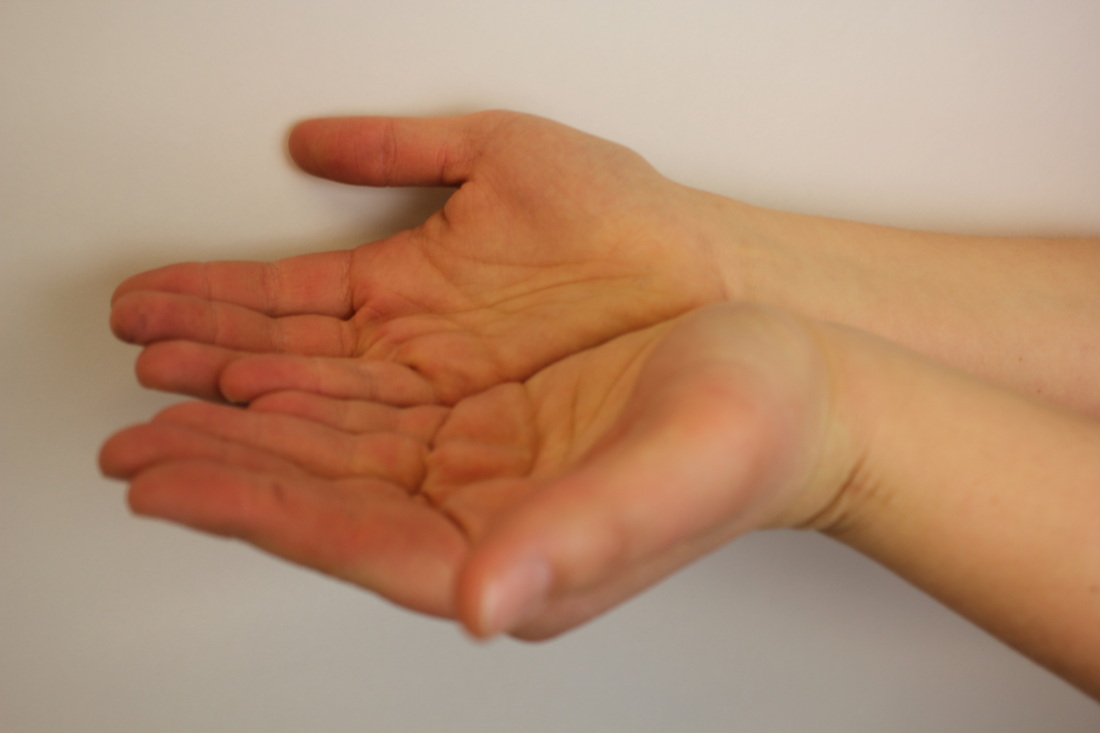
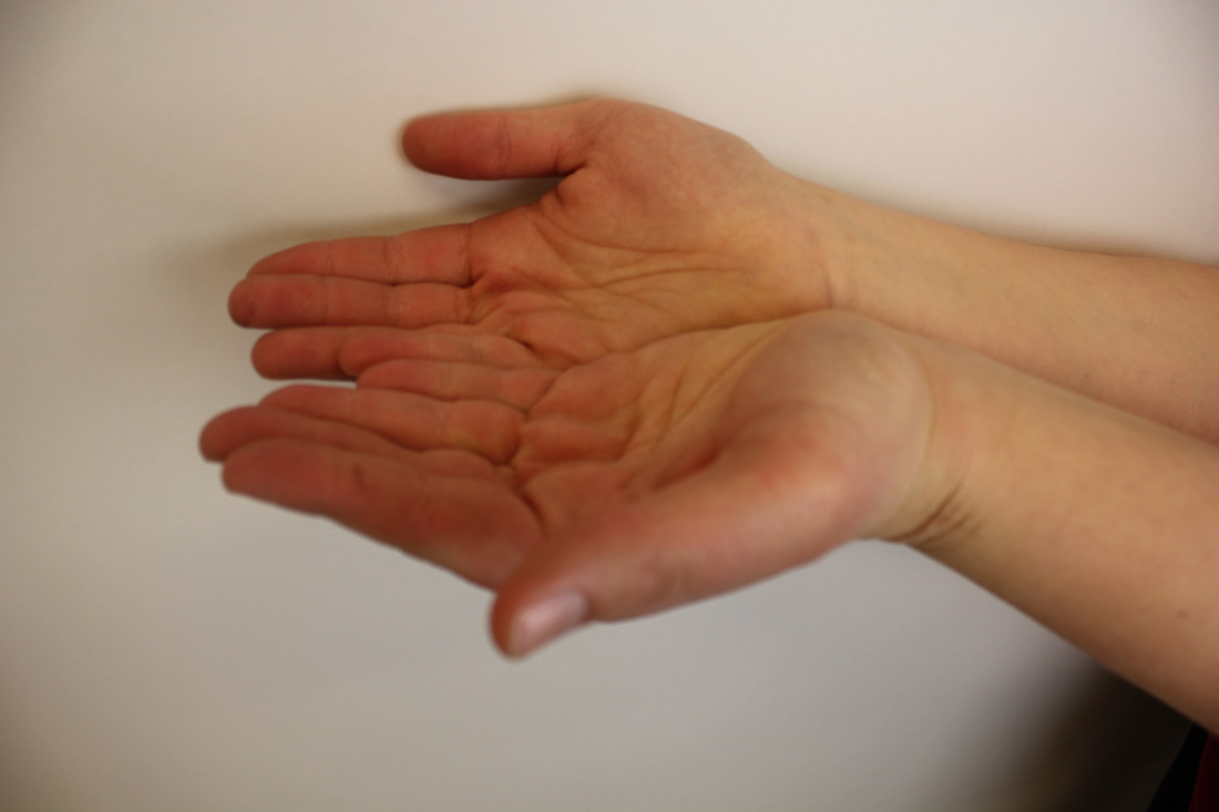
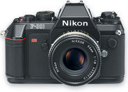
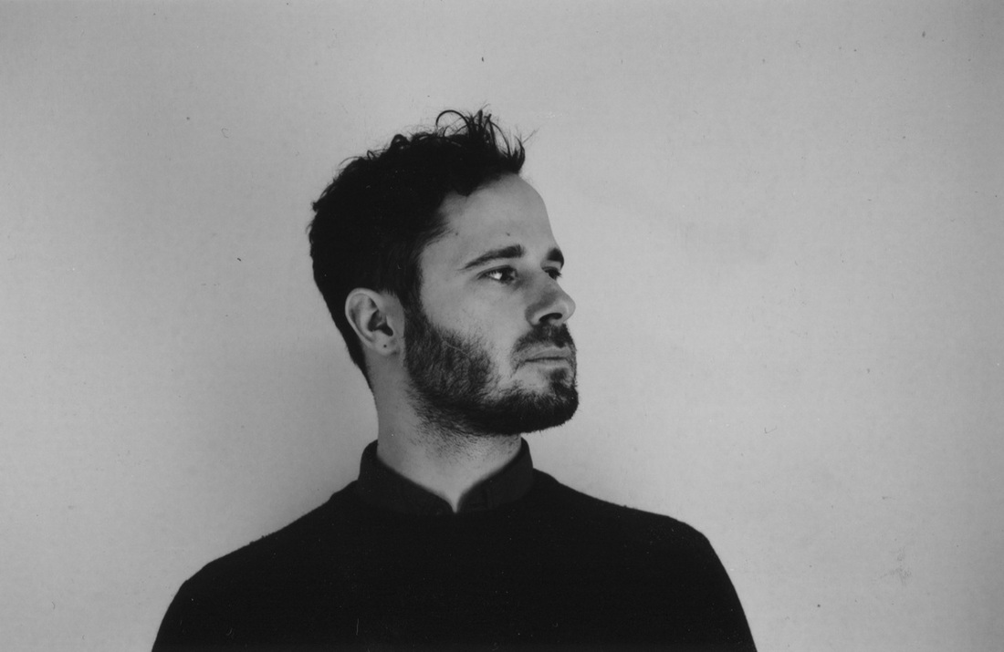
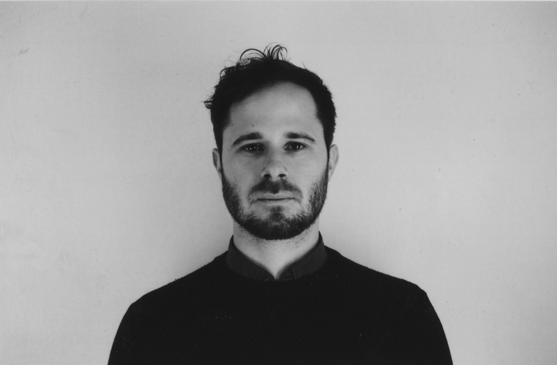
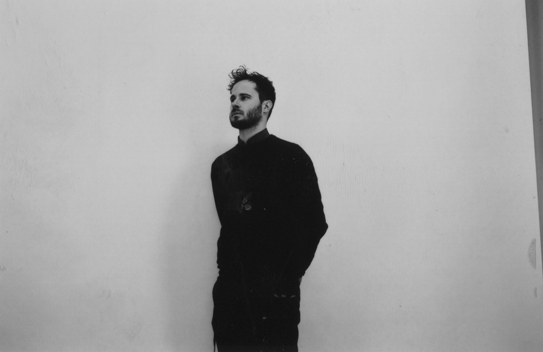
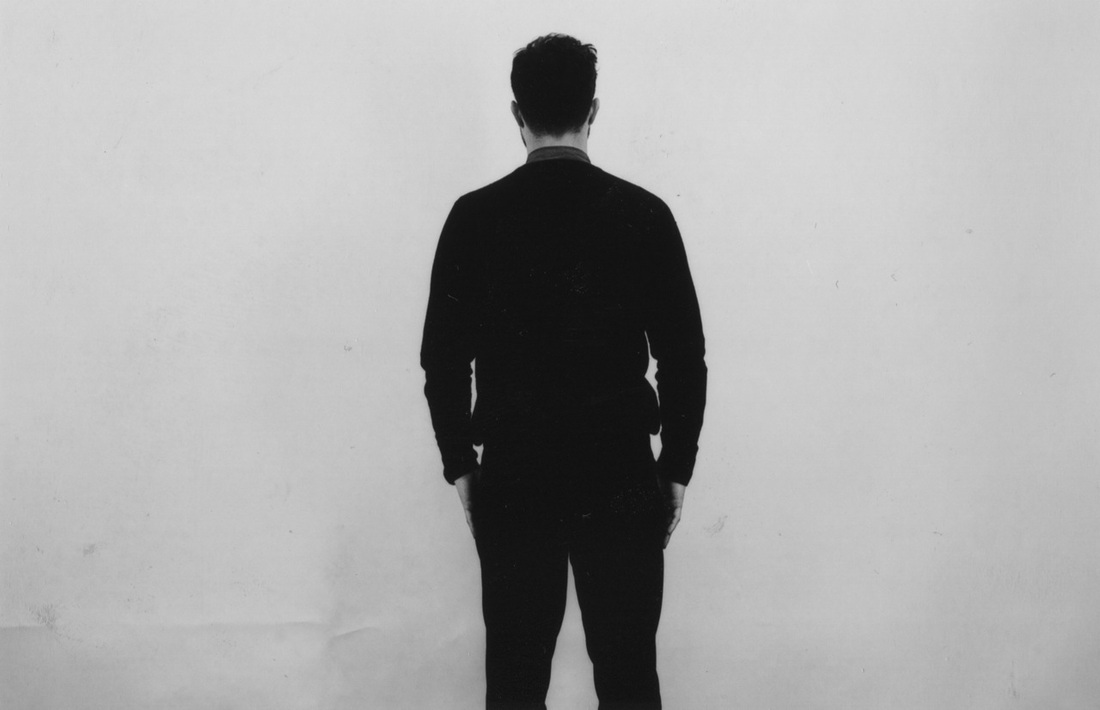
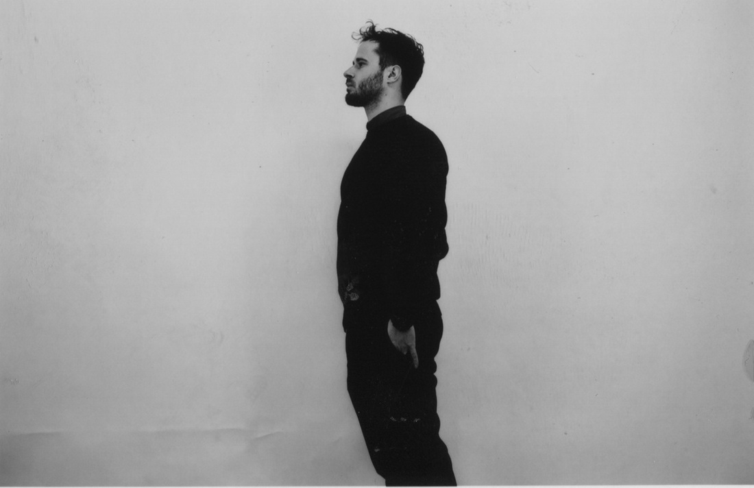
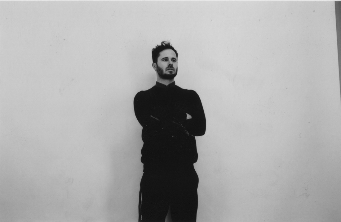
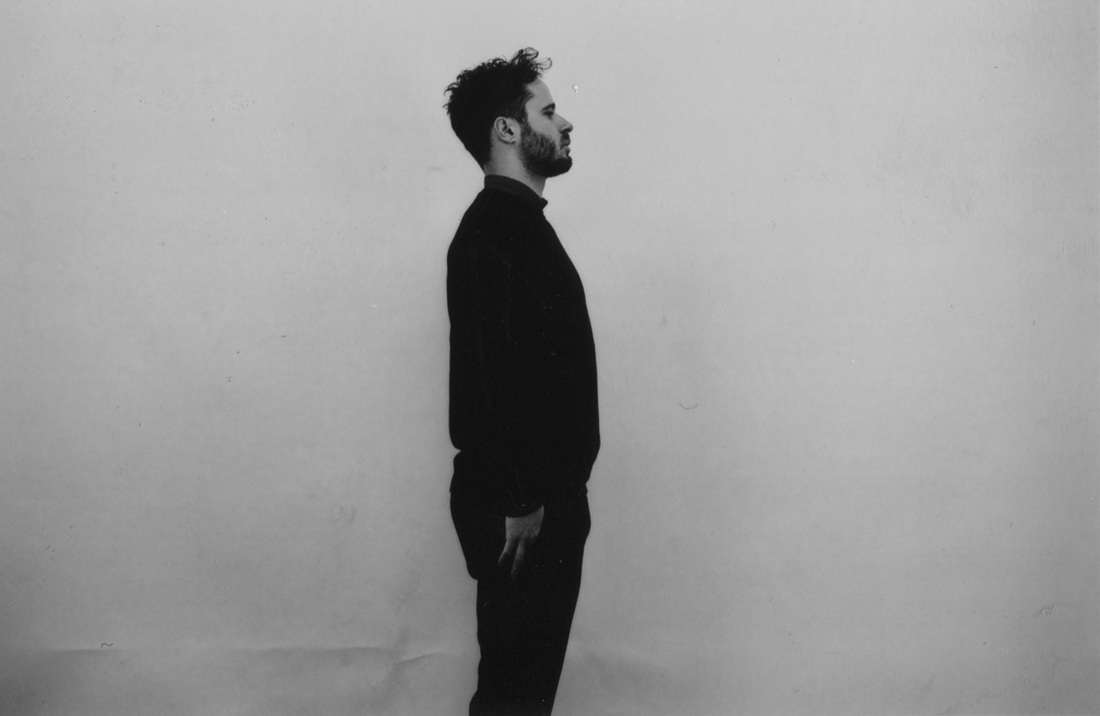
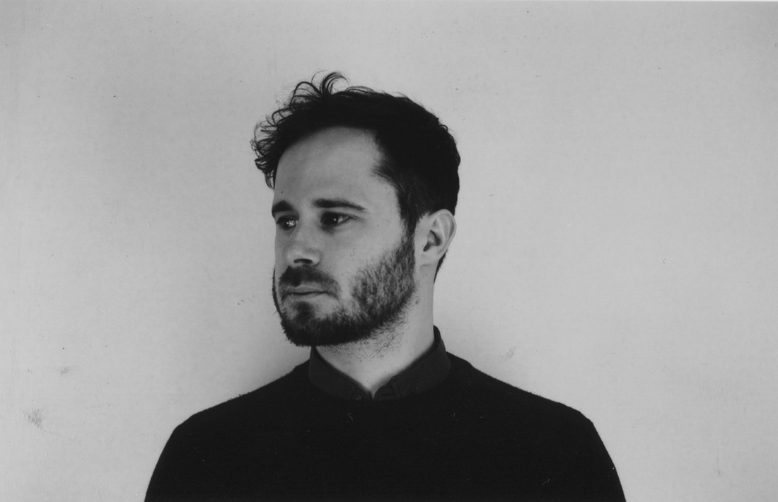
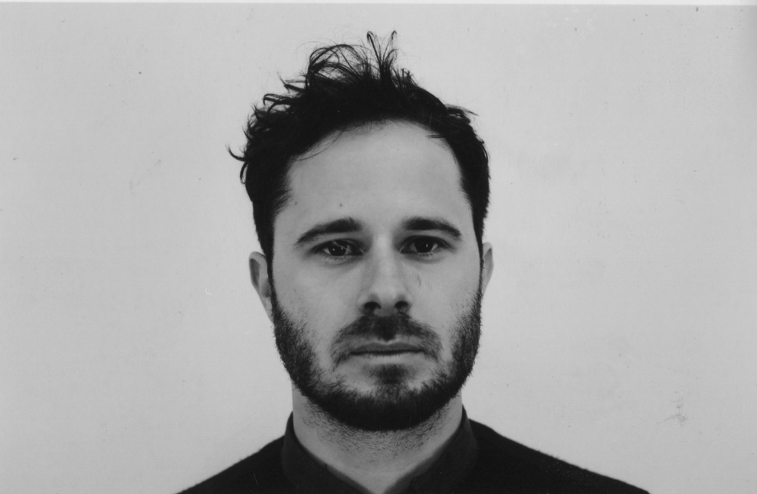
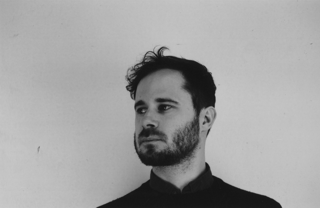
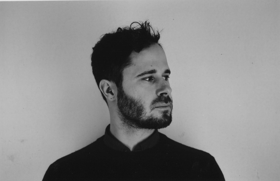
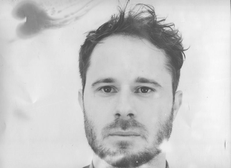
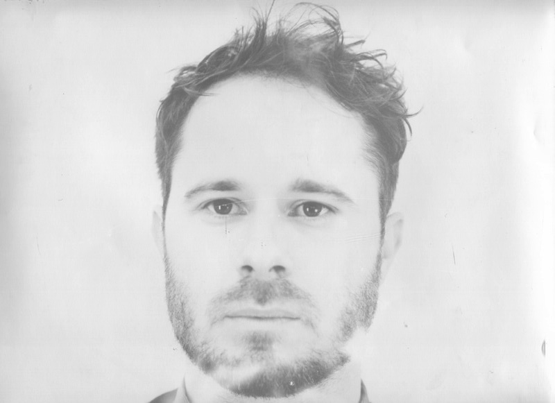
Nikon F-301 Camera
|
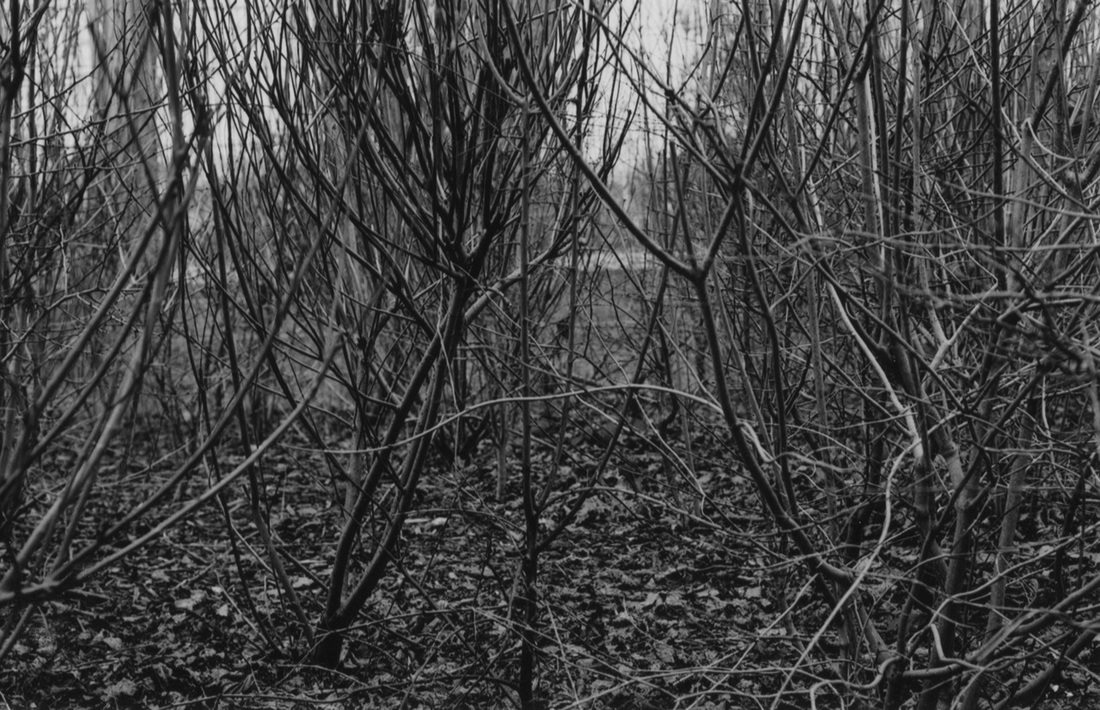
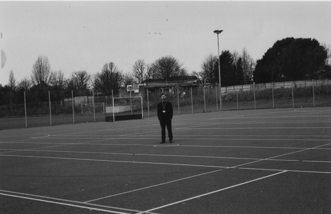
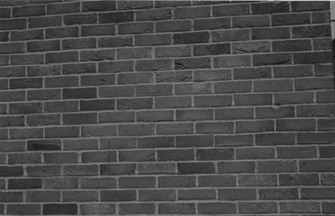
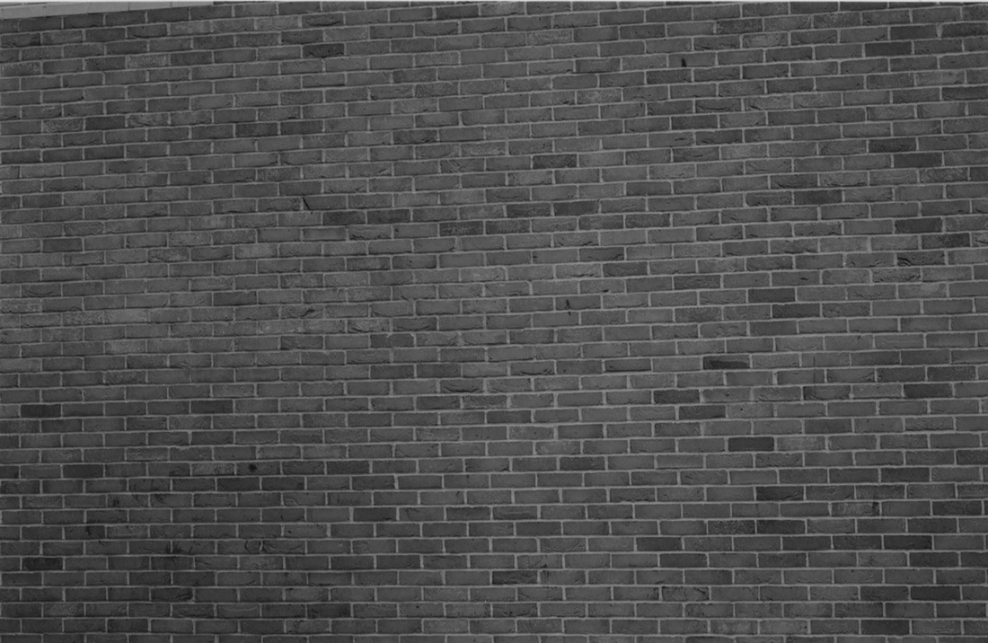
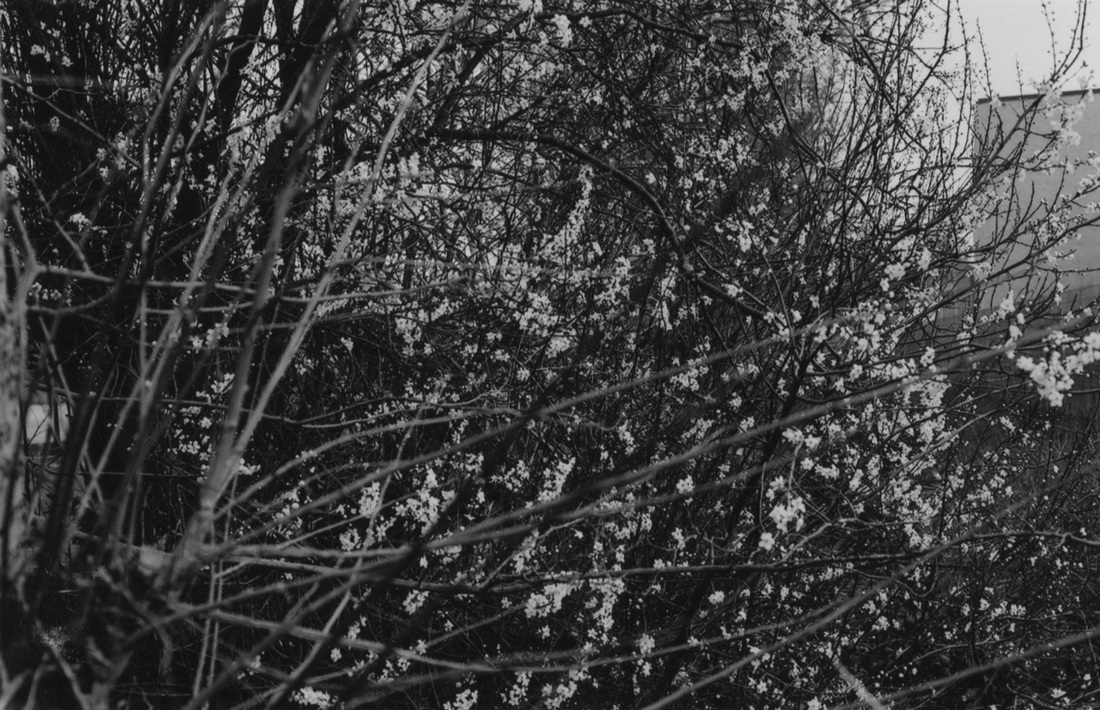
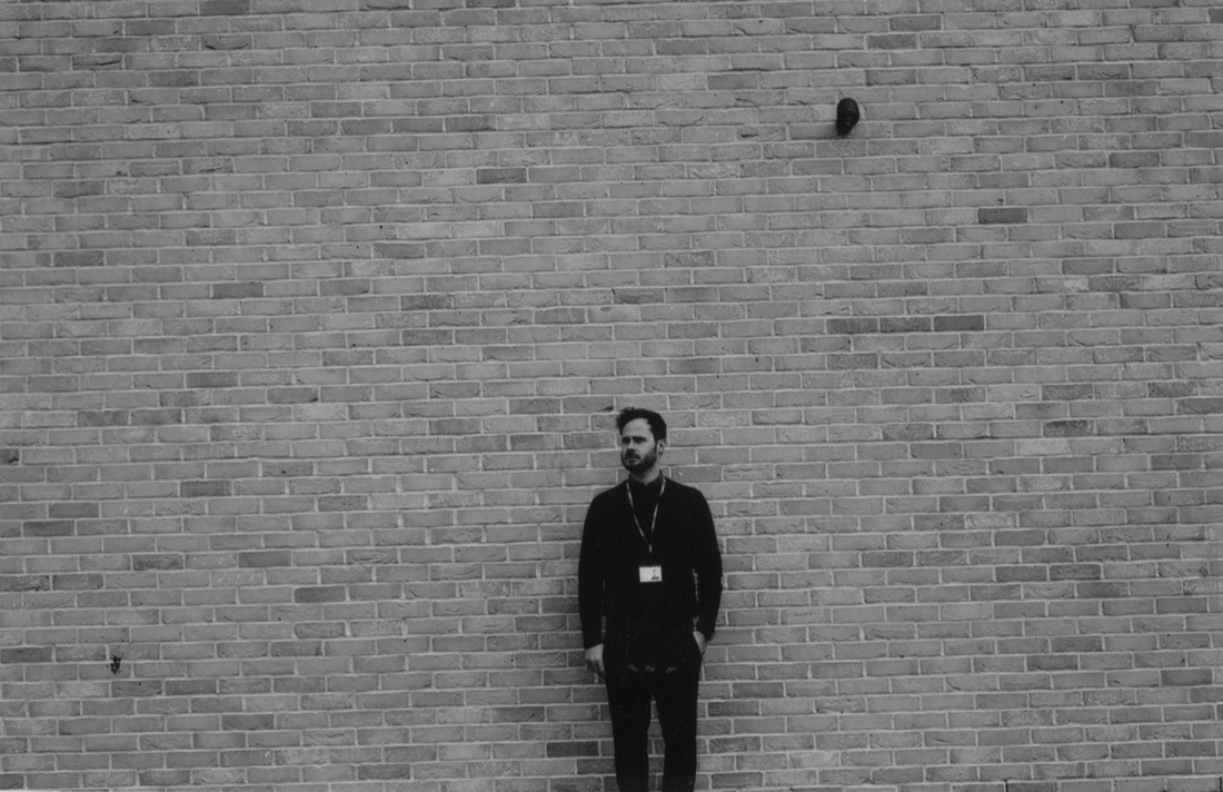
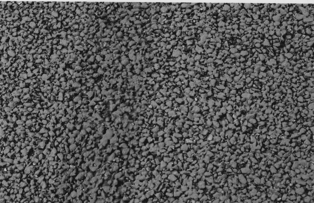
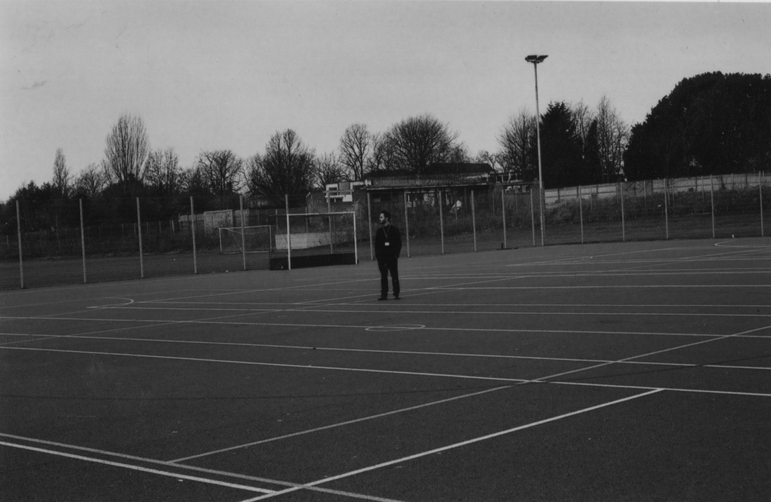
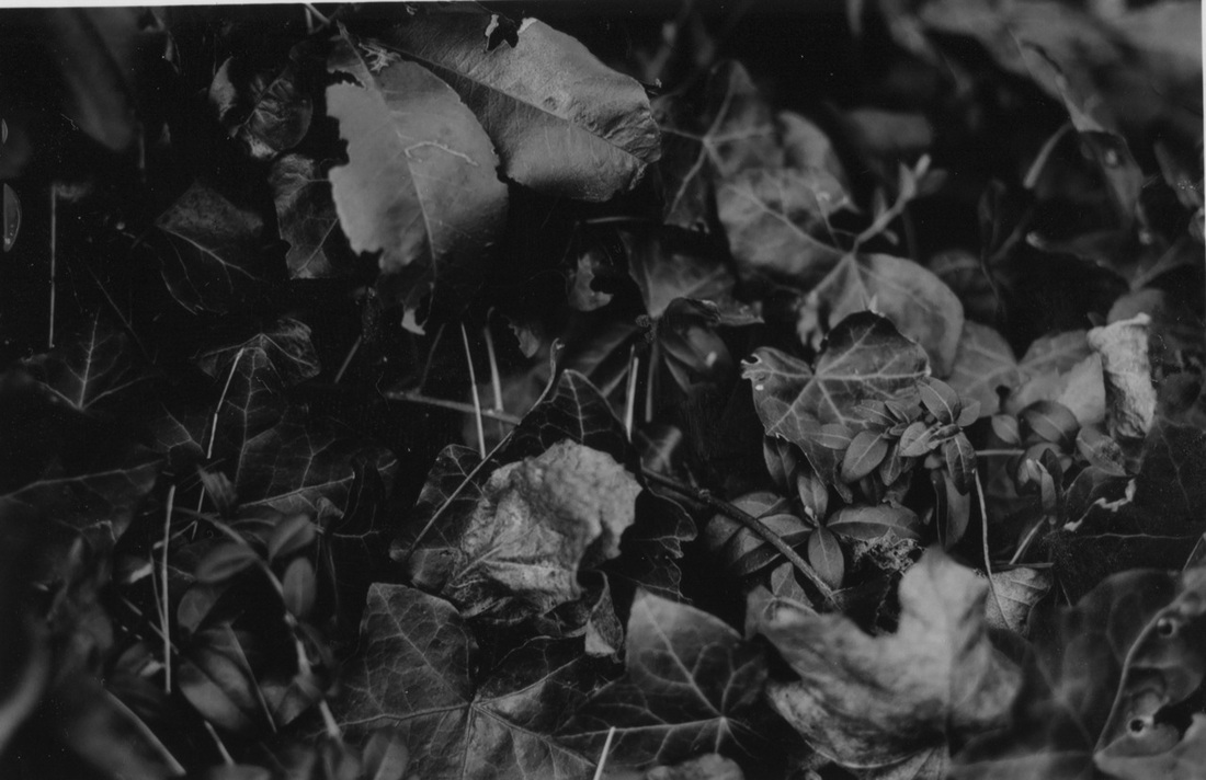
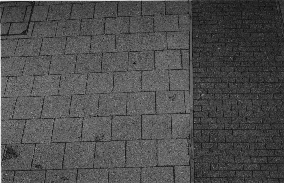
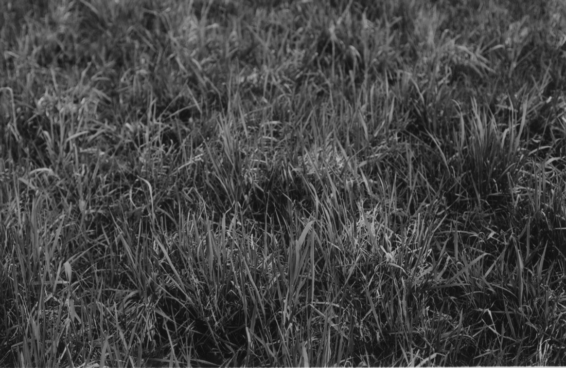
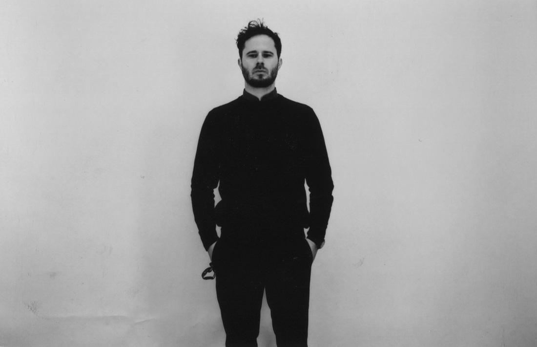
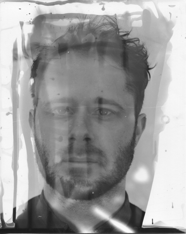
I took 10 portrait images on a white background then I went outside I took 20 photos of different textures of buildings, brick walls, trees and other similar things. My aim was a portrait on top of the image with texture in the background for Double Exposure. The Nikon F-301 camera is heavy, also the film effect is Black and White.
|
|
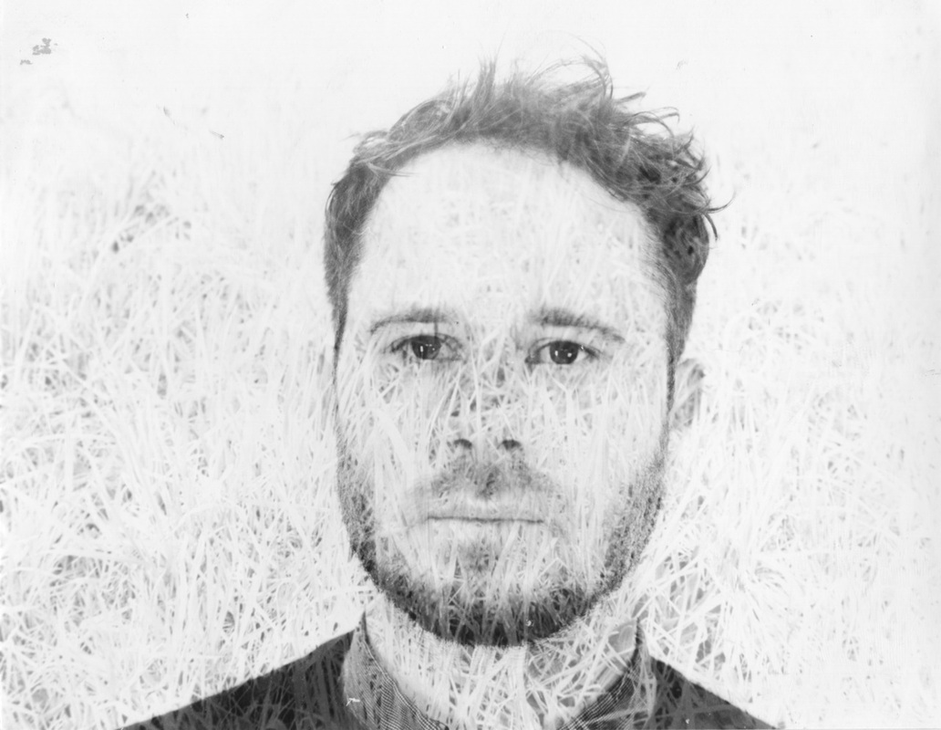
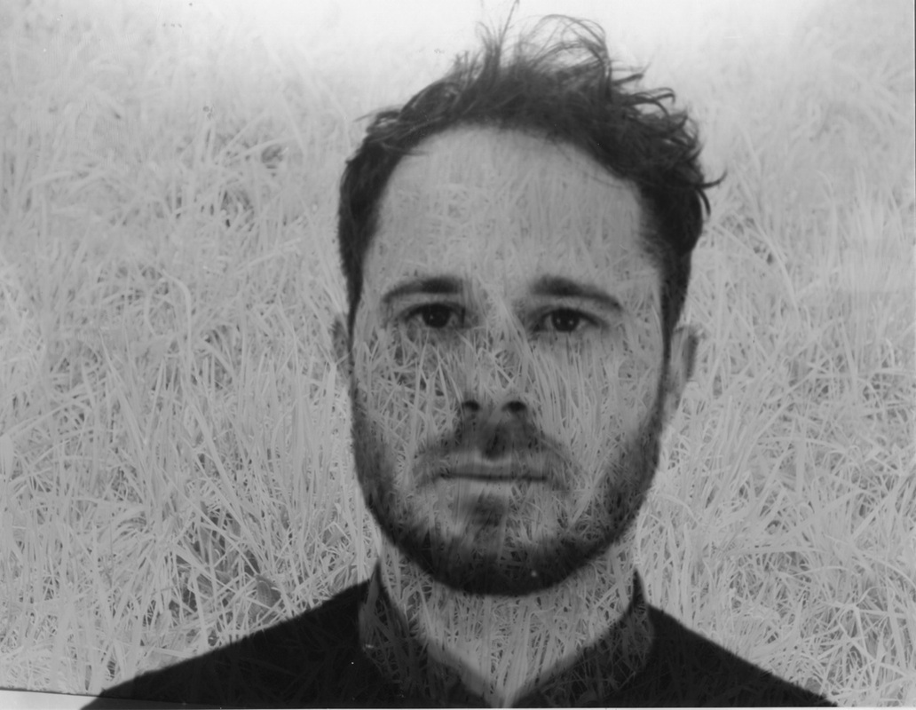
My Black and White film photographs
My double exposure experiments in the darkroom
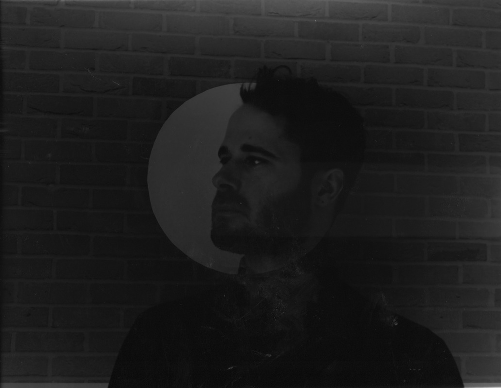
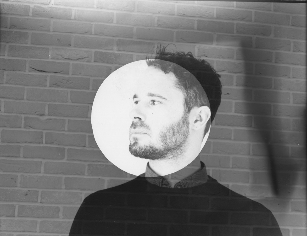
Evaluation
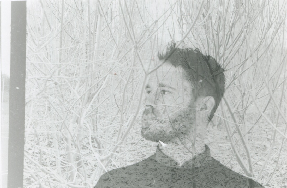
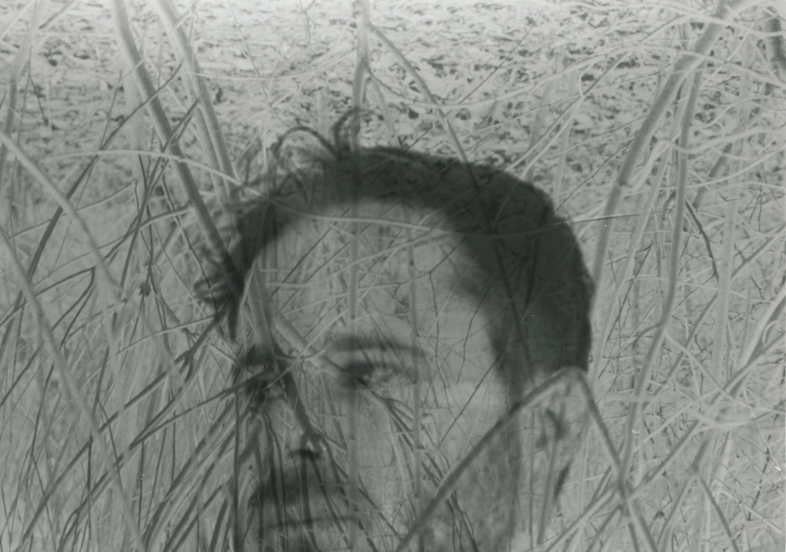
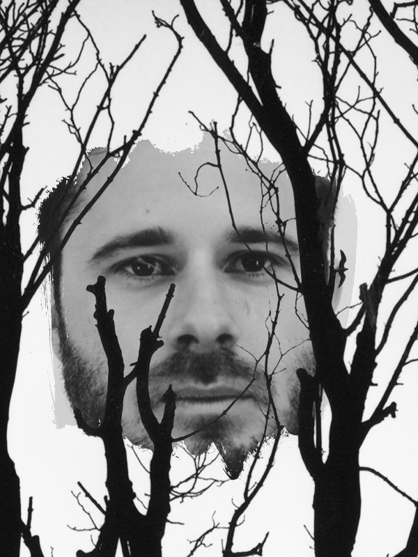
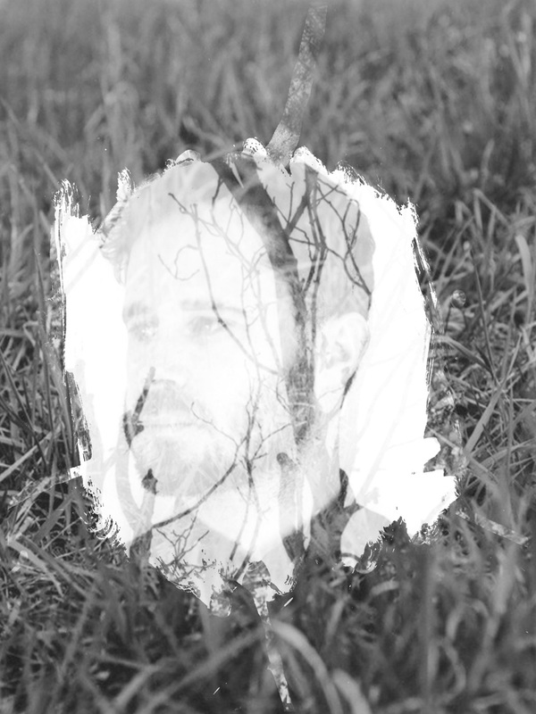
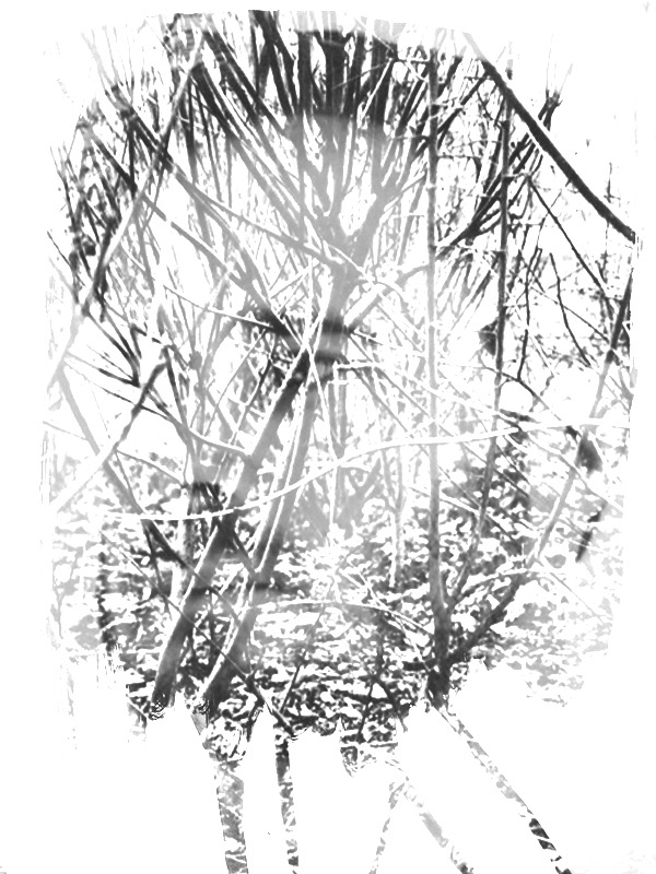
I made these images in the darkroom, I took 32 Black and White film photographs, then I decided which two negative films to use. Some images don't work in the background, like the grass doesn't really show on the white background. I put the light on the sensitive paper in the negative holder for a longer period of time, as for example, on hot day you can't get tanned in short time, you need to stand outside and wait till your tan develops gradually over a longer period of time. So I decided to make the time longer and it ended up working better than the shorter time. I also used the pink sensitive paper to make the paper lighter. Look at Image 1 and Image 2, can you see the different tone and brightness. I like the image of the man in the middle, with trees in the background the best, because I think it is interesting and looks amazing like the man has the trees on his head.
Timothy Pakron Research
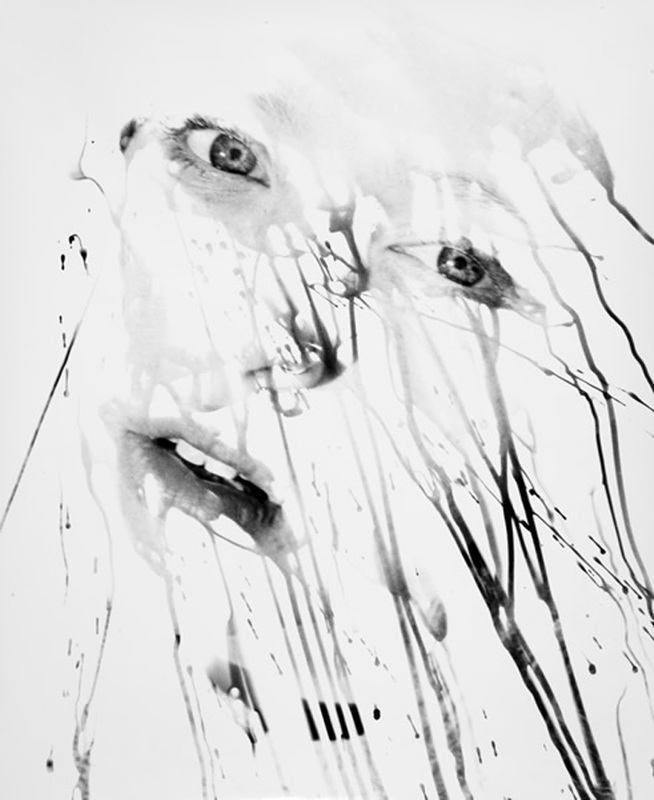
My Response
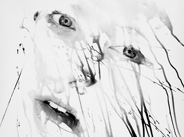
I think those images are very different from other images I made in the darkroom because the images looked like someone painted it but they made those images in the darkroom with a paint brush dripping the chemical down the paper. I think this way is more interesting and much different. I'm sure lots of people have never seen this style before, so when they see this style they may think it is amazing just like fantastic and strange same as the time.
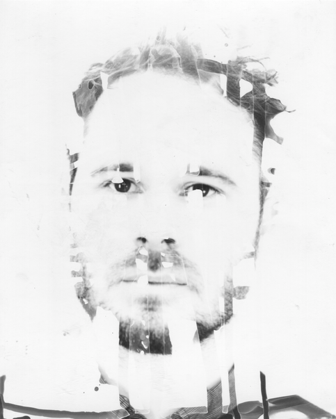
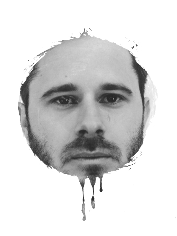
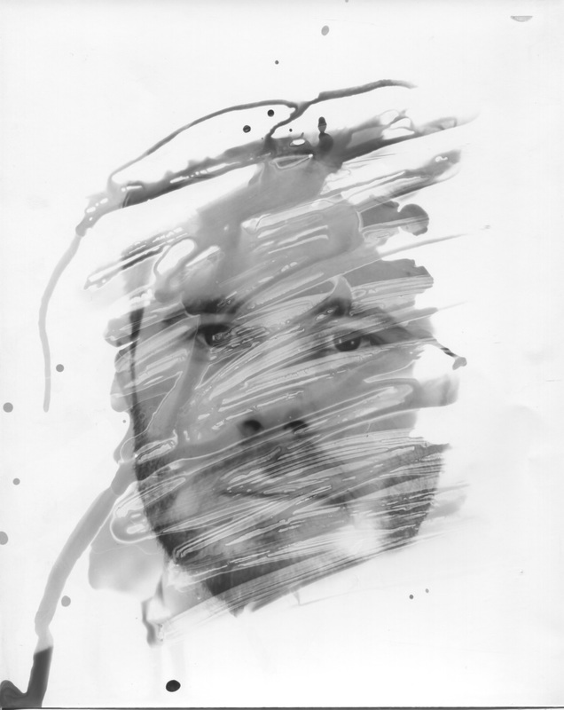
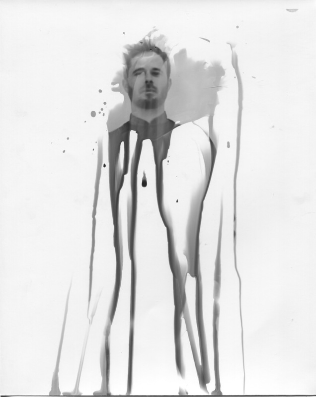
Evaluation
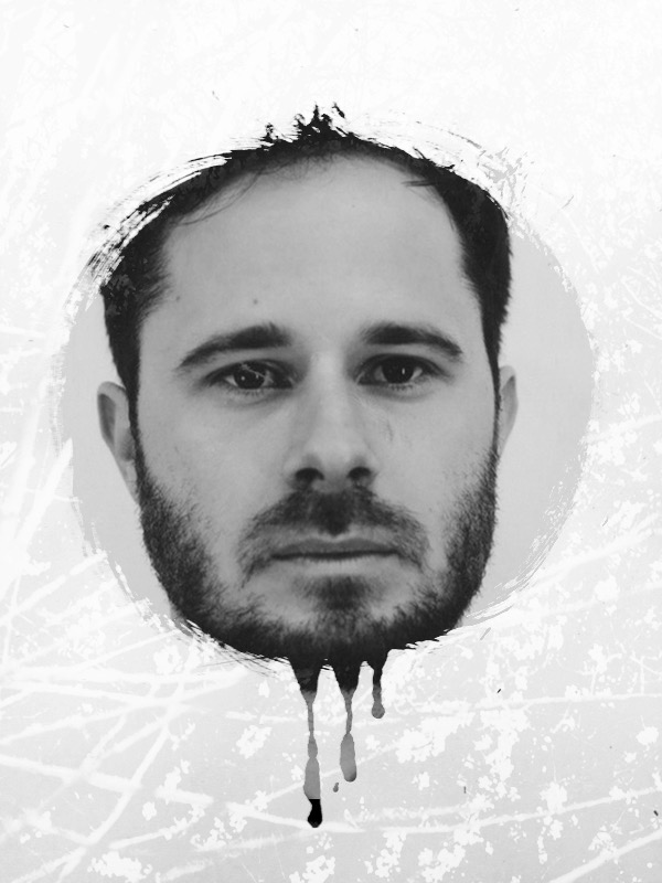
I took inspiration from Timothy Pakron's style when creating this photo. I like this effect better than the Timothy Pakron's because it looks like someone has rubbed part of the face. I like this style as it fits with my theme - strange and fantastic. I think I should make a few more pictures.
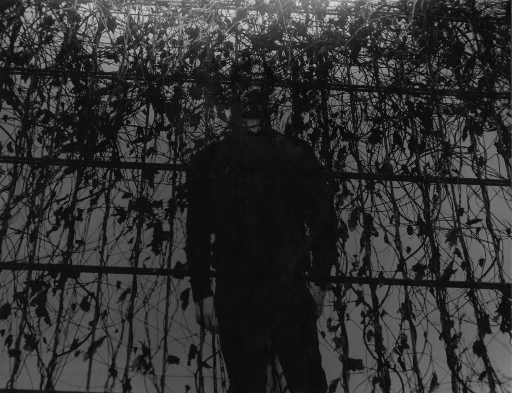
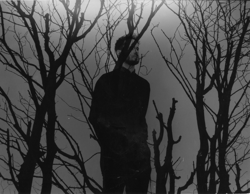
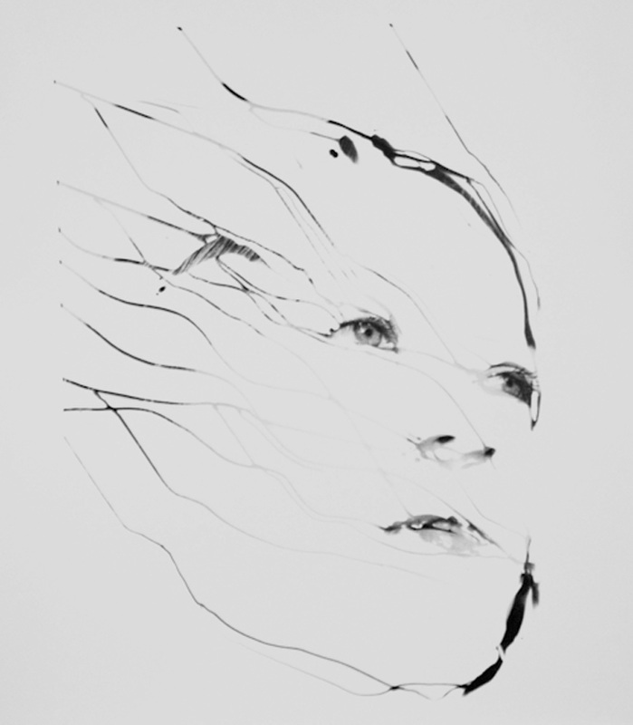
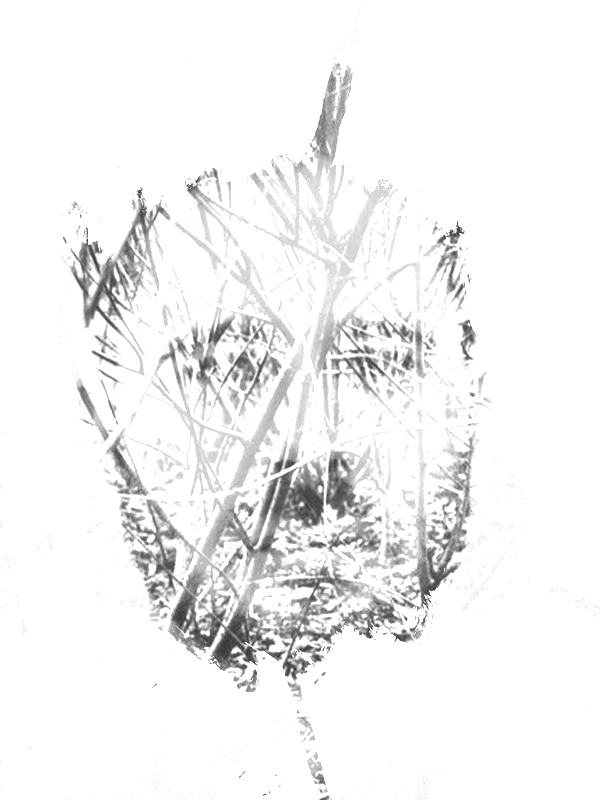
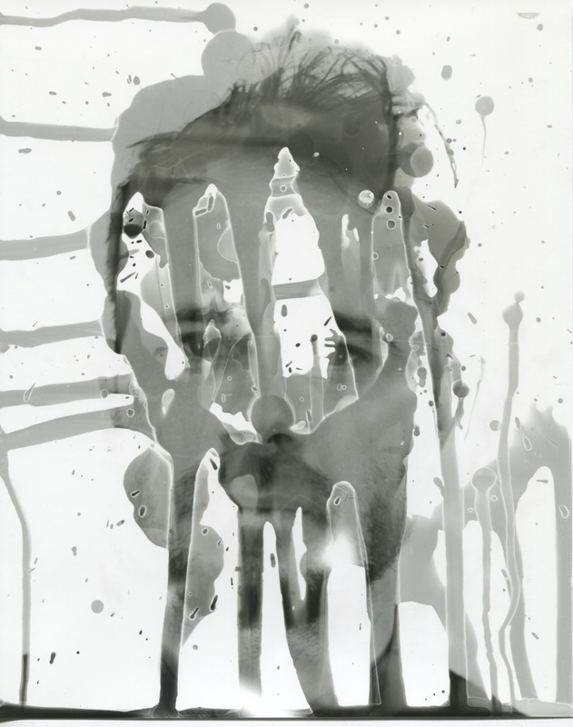
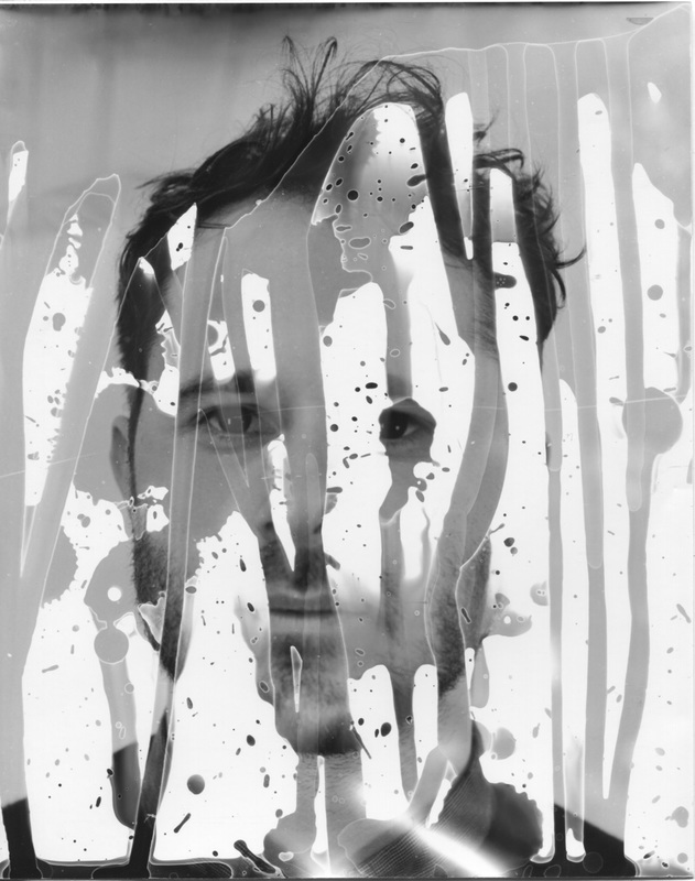
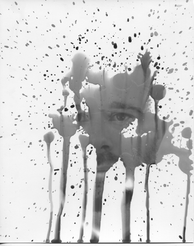
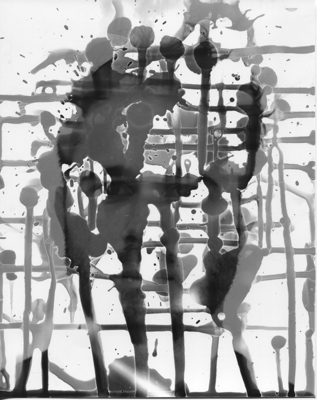
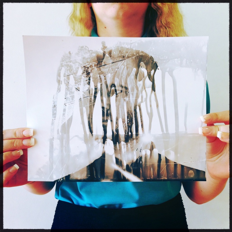
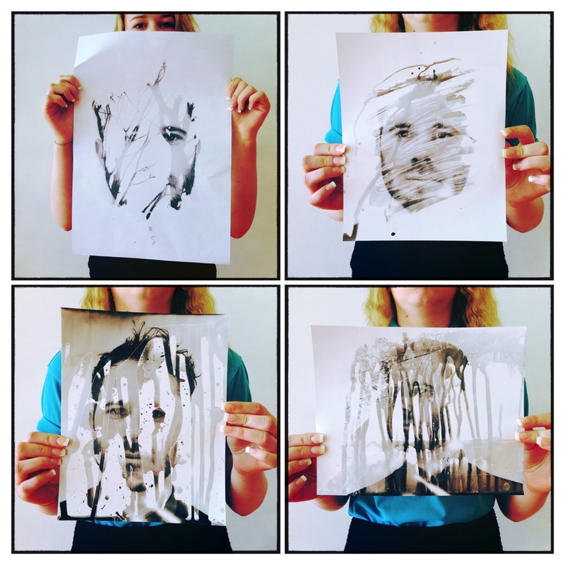
The images I made in the darkroom
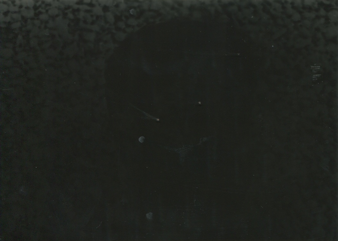
The three images at the top worked better than the bottom two images, The bottom two images are too dark. This is because the light exposure was too bright. I had to turn the exposure lens down by two notches and then take the picture again, this produced a lighter image.
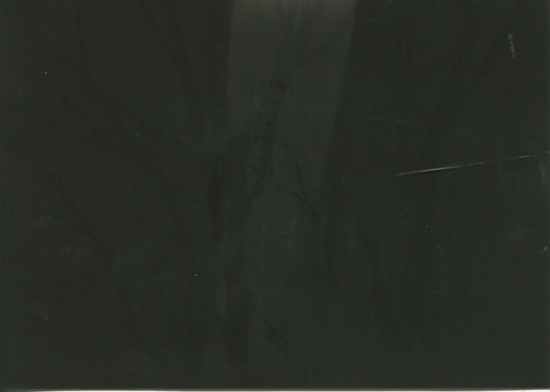
The last picture is dark because I turned the main light on whilst the picture was lying in the developing tray. I did not realise that the light would affect the picture once it had been taken. It quickly turned very dark and I was very disappointed as it had originally been a good photograph.
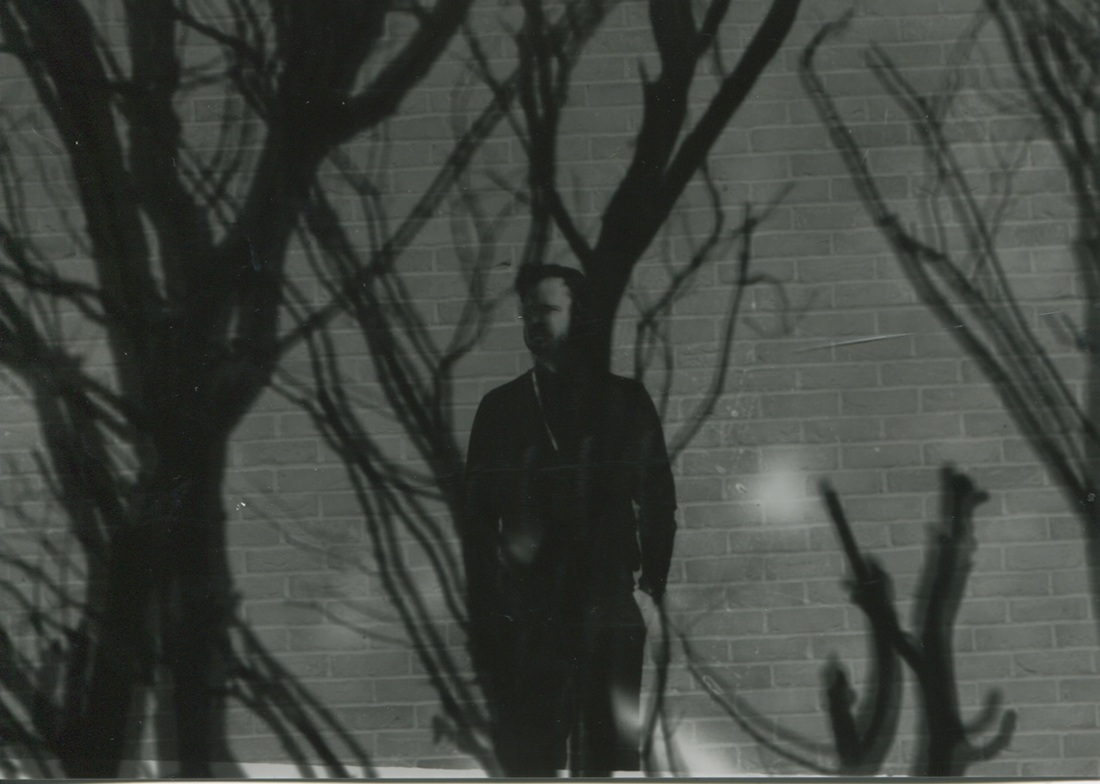
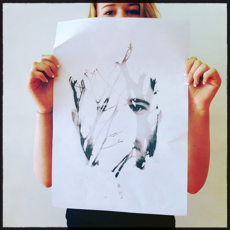
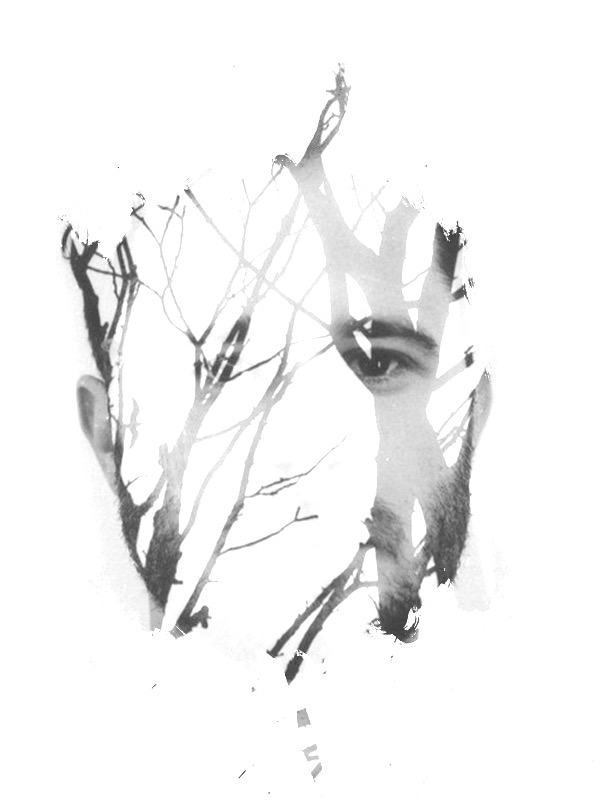
I decided to experiment with moving the picture while it was exposed to the light, (the effect is shown in the second picture), I like this image because it added more mystery, the trees blend in with the bricks in the background with a person in middle of the image.
The last picture is dark because I turned the main light on whilst the picture was lying in the developing tray. I did not realise that the light would affect the picture once it had been taken. It quickly turned very dark and I was very disappointed as it had originally been a good photograph.
I decided to experiment with moving the picture while it was exposed to the light, (the effect is shown in the second picture), I like this image because it added more mystery, the trees blend in with the bricks in the background with a person in middle of the image.
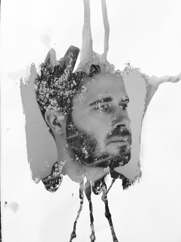
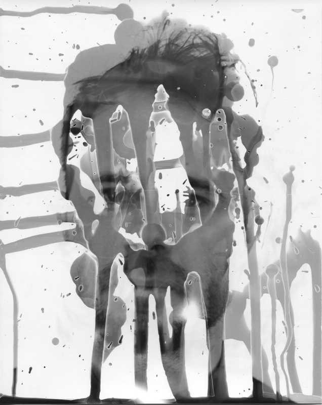
Painted on the paper
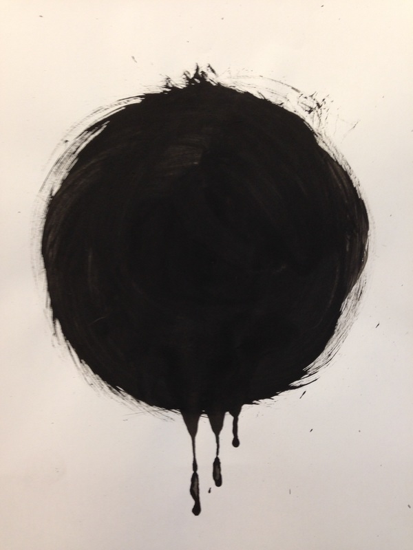
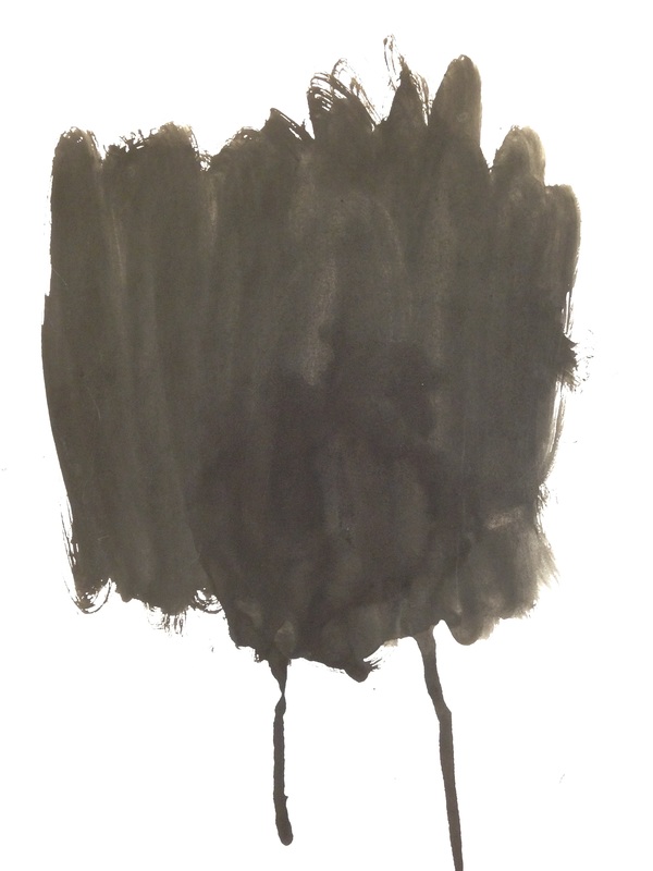
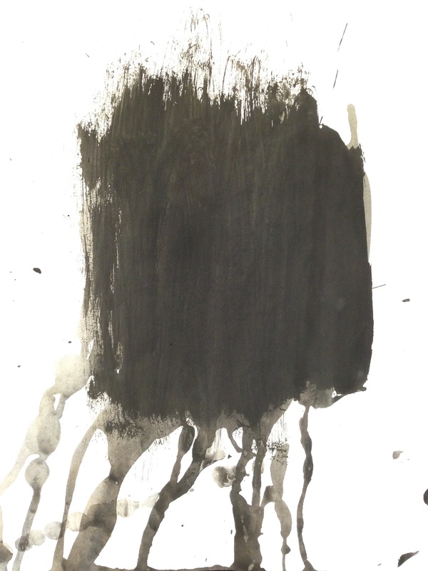
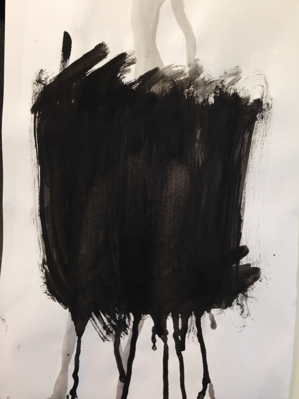
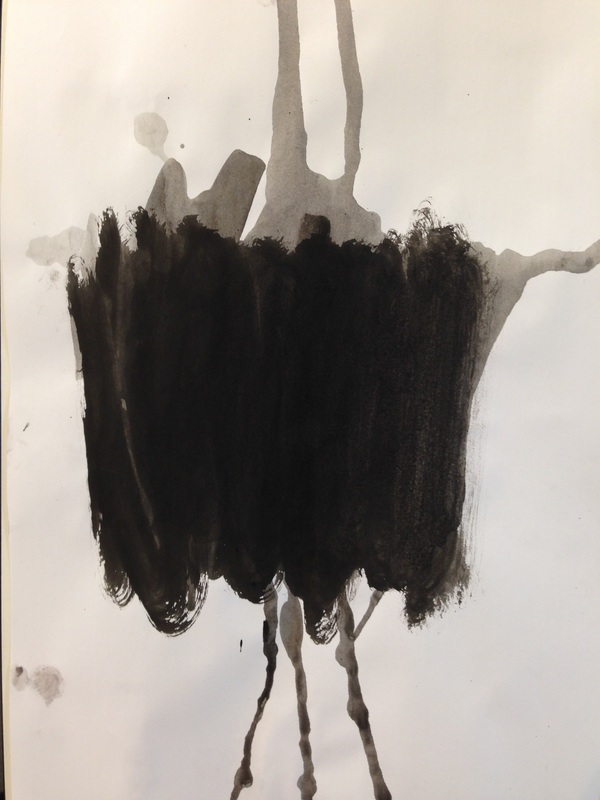
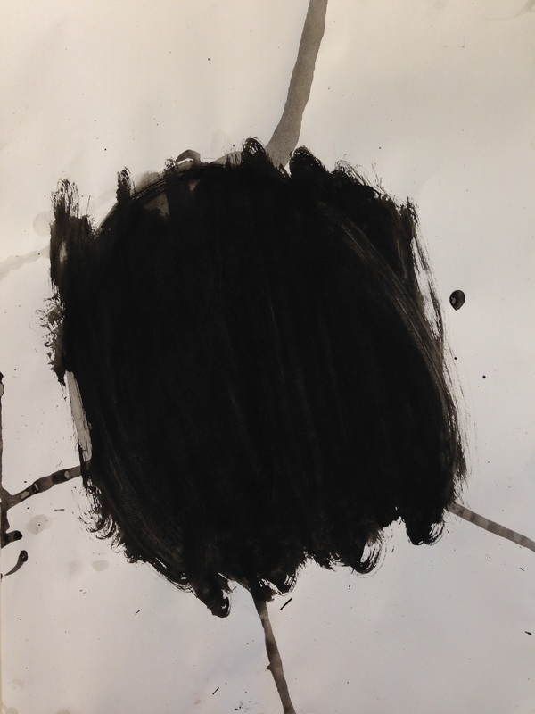
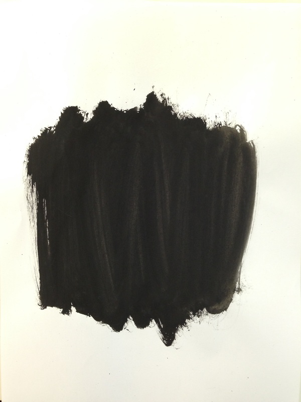
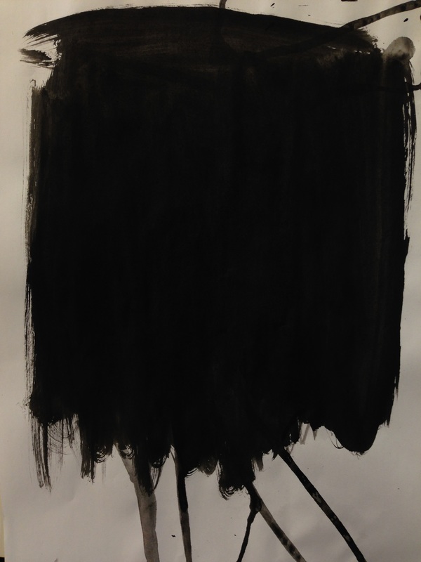
I painted on plain paper because I want to add a person in the middle of painted shapes. I was thinking of creating these images as I felt that it will look different, fantastic and strange just like my theme.
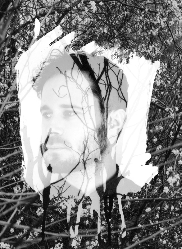
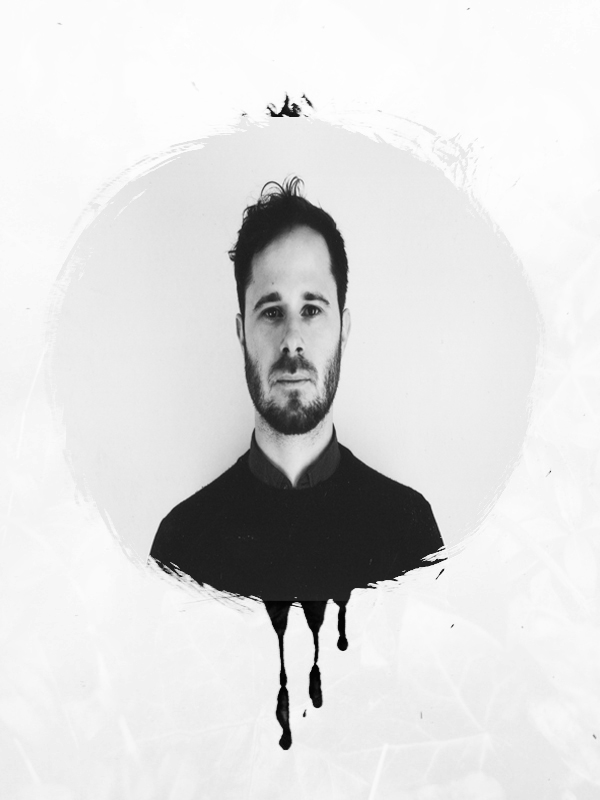
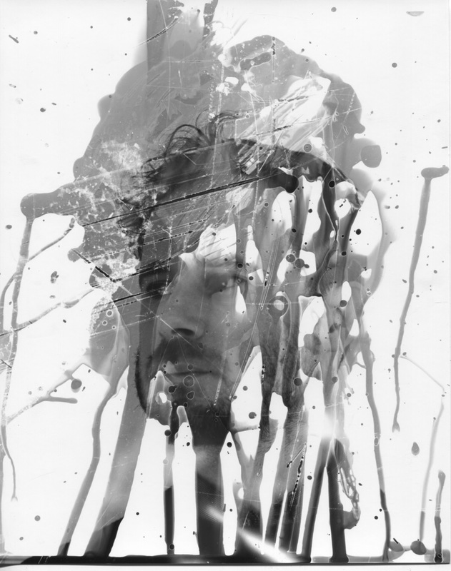
The images I made in Photoshop


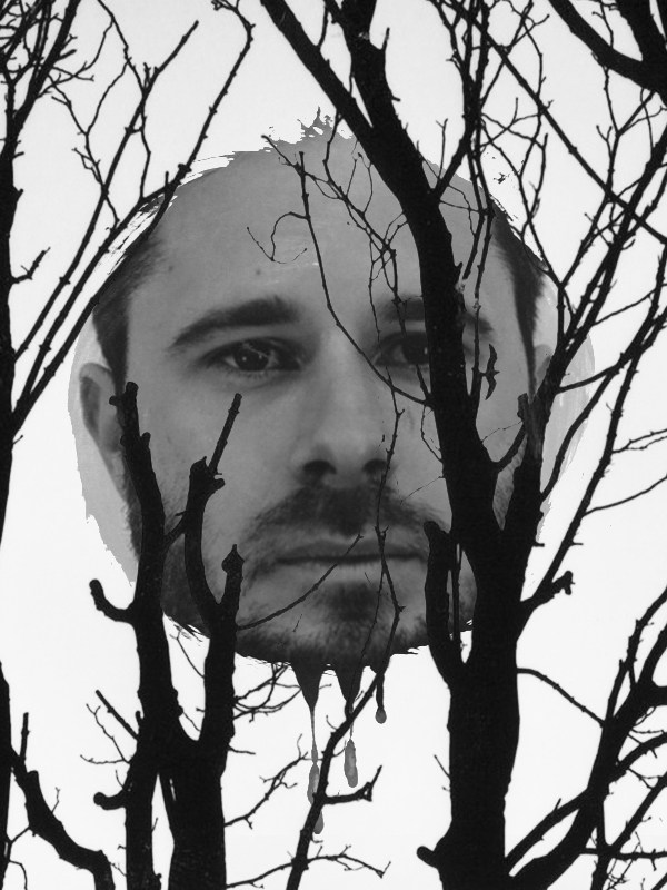
Evaluation

WWW: I like the white lines on the image because it looks like the man has some magic on him.
EBI: The face is too stretched, I need to click Cmd T and shift & drag so the face won't be able stretch and improve the shape. I made a mistake I didn't clicked shift same as time drag the image. I also stretched the middle of drag which I should have not. |

WWW: The face looks much better than other image because it is normal size. I prefer the white lines on other image, but I quite like this image because it look like the man has half of tree face and his normal face other half. He look like he is hiding from someone. I prefer this image because it is like 'Fantastic and Strange' theme,
EBI: I would prefer the white lines on him and I also should change the tone of image like sharpness to make it look amazing. |
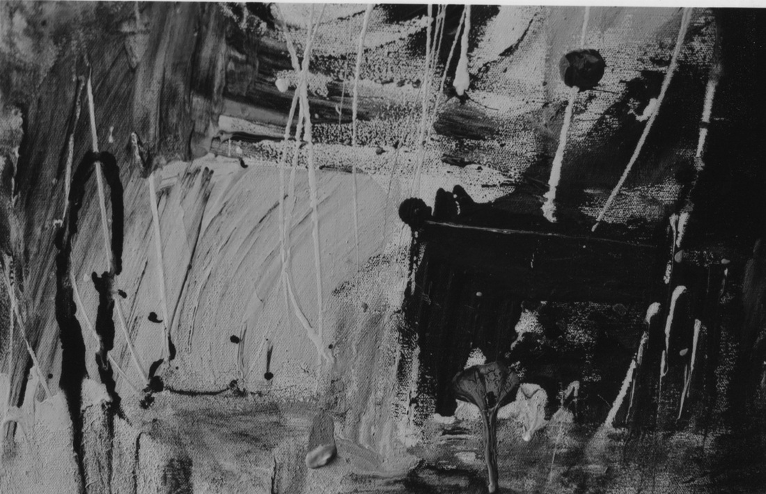
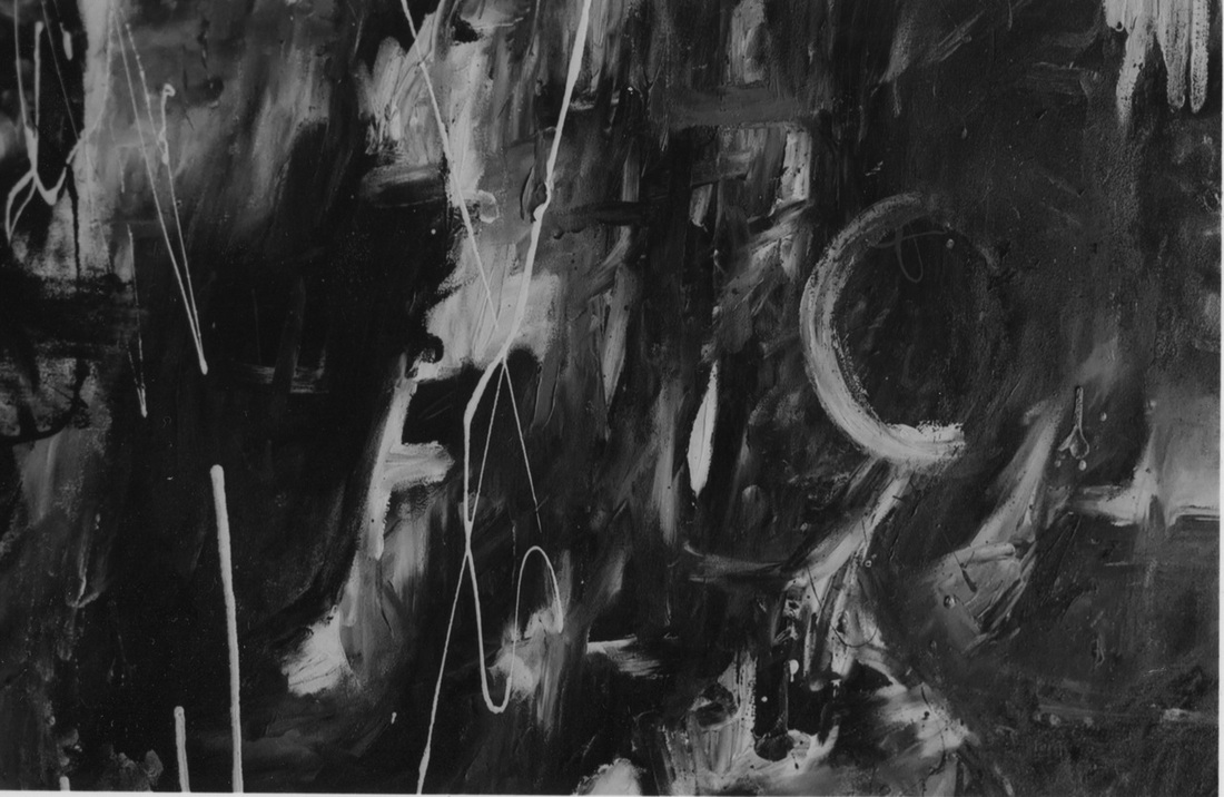
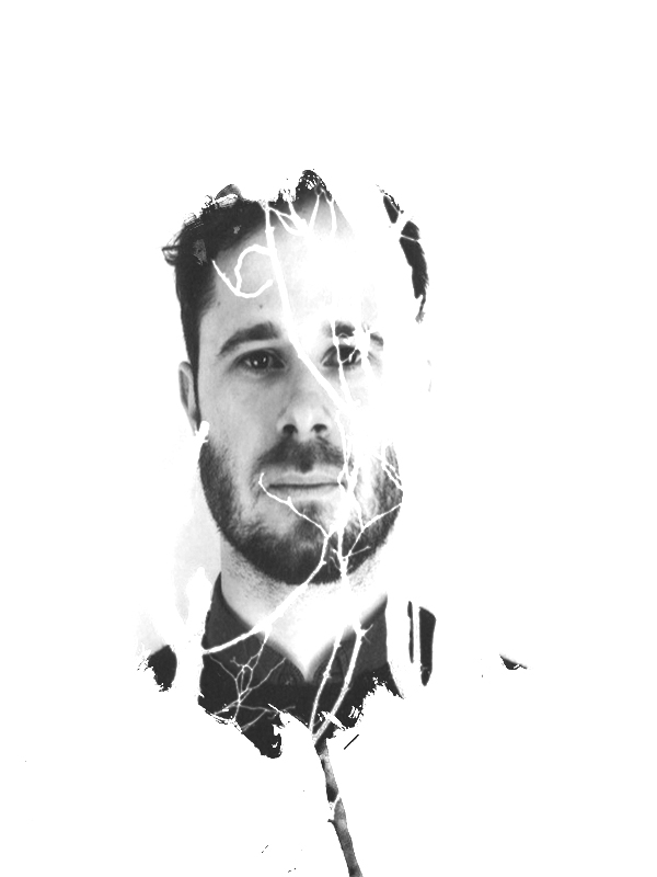
Timothy Pakron's style
Evaluation
I feel that I was successful in my work, I followed my theme and created artworks that link into my theme of Fantastic and Strange.
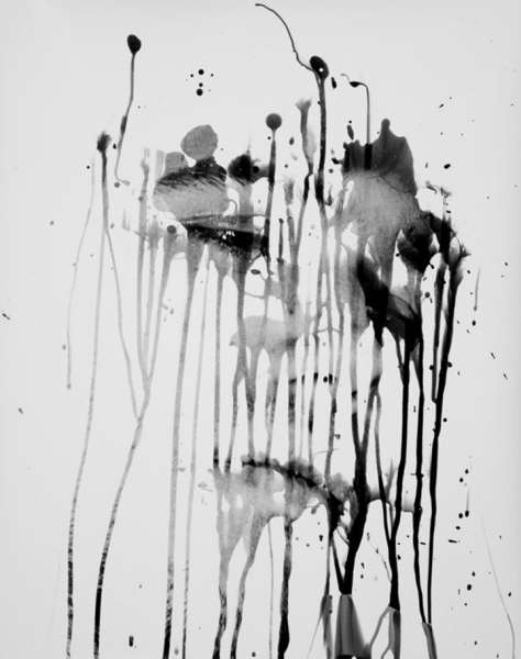
- I used a small sized piece of photographic paper to test the light exposure. My previous experience in the dark room had taught me that too much light creates very dark images. I exposed the photographic paper to the light for 5 seconds.I put the paper into the tray with the developing chemical and was happy with the end result.
- I then used a big piece of photographic paper and raised the arm of the enlarger, I knew that I needed to add extra exposure time because of the different height of the light. I counted 10 seconds then checked the picture. It was very pale so I tried doing it again for 30 seconds. This was too dark so I settled for 15 seconds which produced the right tone.
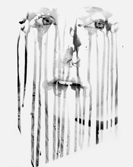
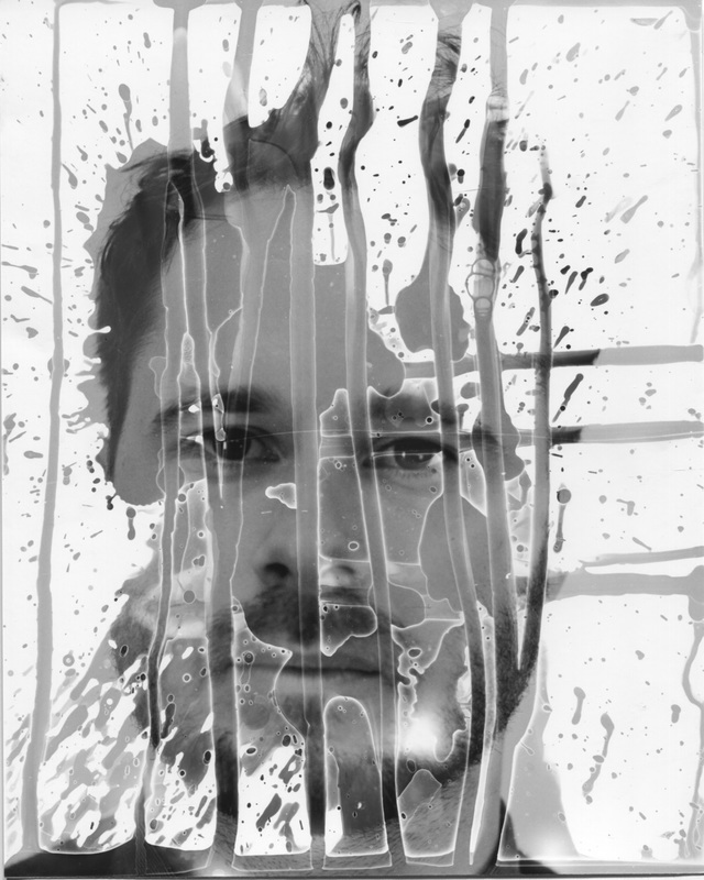
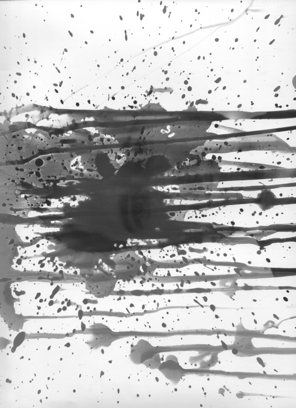
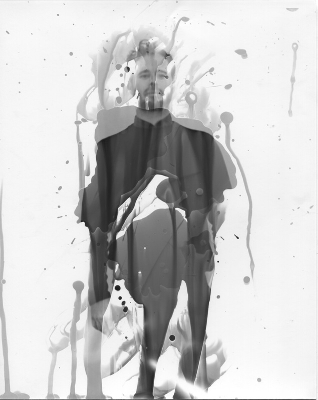
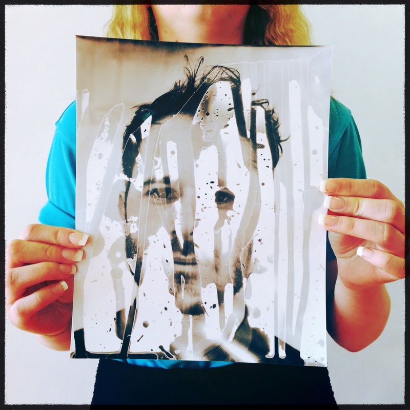
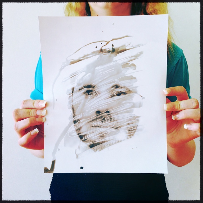
- I looked through my negatives and picked a close up shot of a face as this was similar to Timothy Pakron's images. I wanted to try different effects, splashing the photo with developer chemical and waiting to see what result it produced. I put the photographic paper into a dry tray then used a pipette to put the developer chemical on the picture. I tipped the tray to create lines similar to TP pictures. My results were mixed and I needed to practice a variety of different effects and amount of cd before I produced pictures that I was happy with. I used a paint brush, when applying the developer chemical, for two of the pictures. This enabled me to carefully paint areas that I wanted exposed like the eyes and mouth etc.
- I dripped on the image using by chemical called Developer, I waited for it to come up with something then I dripped on more to make it look better and interesting. I tried this technique on lots of images because I need to improve my skill, then after that I put all those images in the Stop Bath then Fix. I pegged those images to dry.
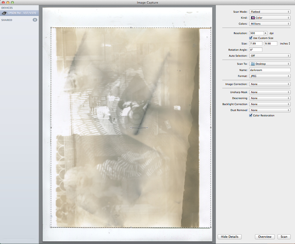
- When the images dried, I scanned and upload them on to the website.
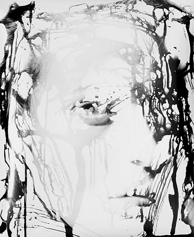
- I produced some of the images in Photoshop, which look like Timothy Pakron's style but created in different ways. I picked the images I like to blend together, then I leave a persons face on it and clicked on select then colour range to put the background as back on the face then I picked the background to blend with. I made those images in Black and White effect, then I clicked cmd A and copied it. I pasted in shape - select similar and paste special on the face image and it will come up confusing. I clicked cmd A and T to drag the image even smaller or bigger to make it look better. Then after that, I changed the tone to make it look blended. I edited the image and make it look more fantastic and I added other background in to make it look even more strange. I save those images and printed these off.
I feel that I was successful in my work, I followed my theme and created artworks that link into my theme of Fantastic and Strange.
Final Outcome


Evaluation
For this exam unit, I have chose 'Fantastic and Strange' as my theme. I chose this theme because I want to do a hard challenge and I like to look at 'fantastic and strange' images. The reason is; it is very interesting and this theme suits me. I have looked and researched lots of photographers work links to 'Fantastic and Strange' theme. The artists that links to my work are Jerry Uelsmann, Harry Callahan and Timothy Pakron.
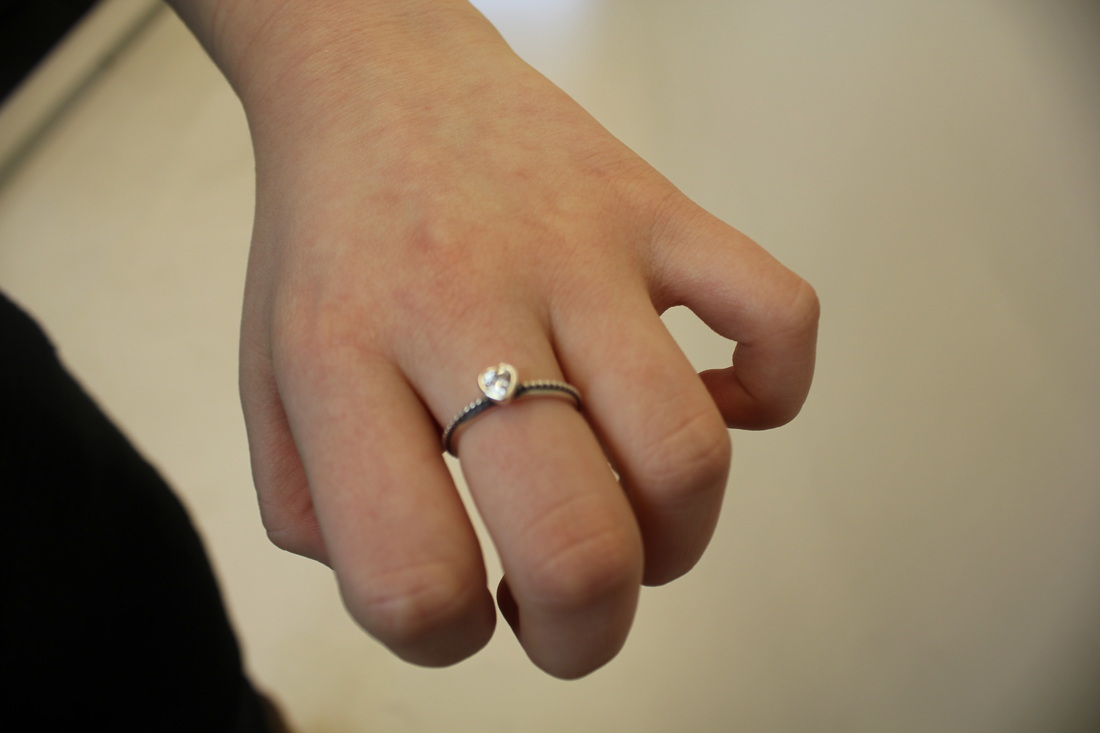
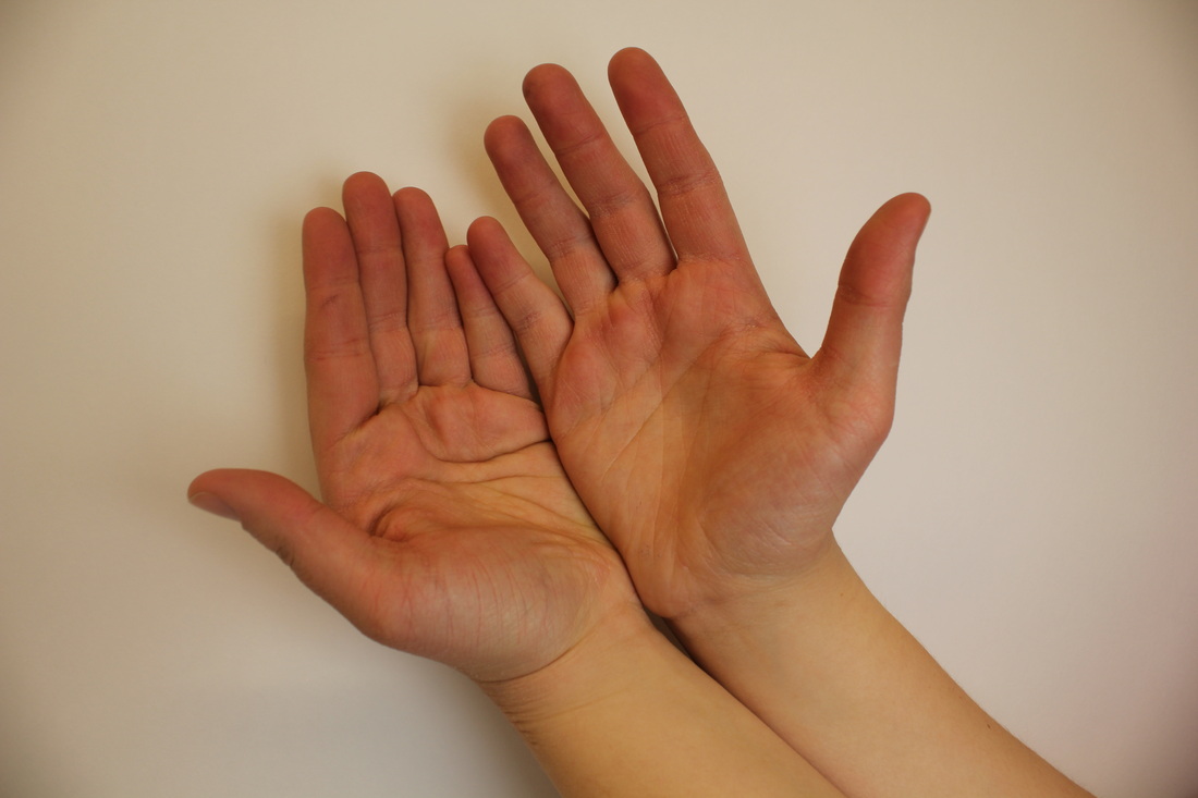
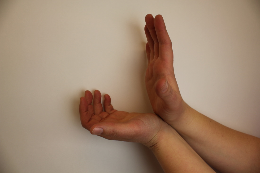
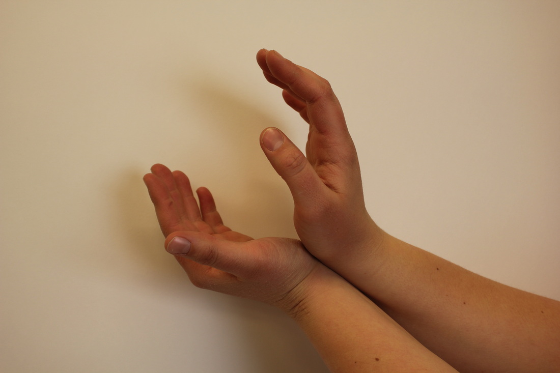
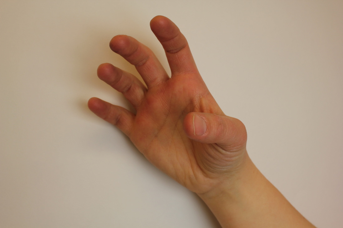
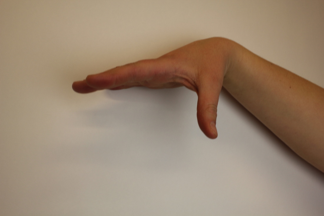
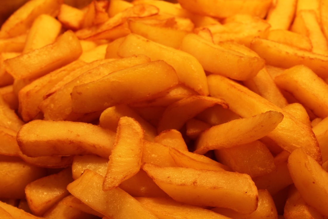
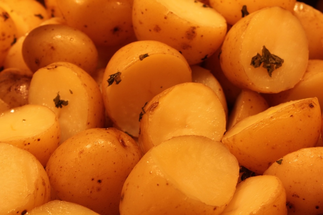
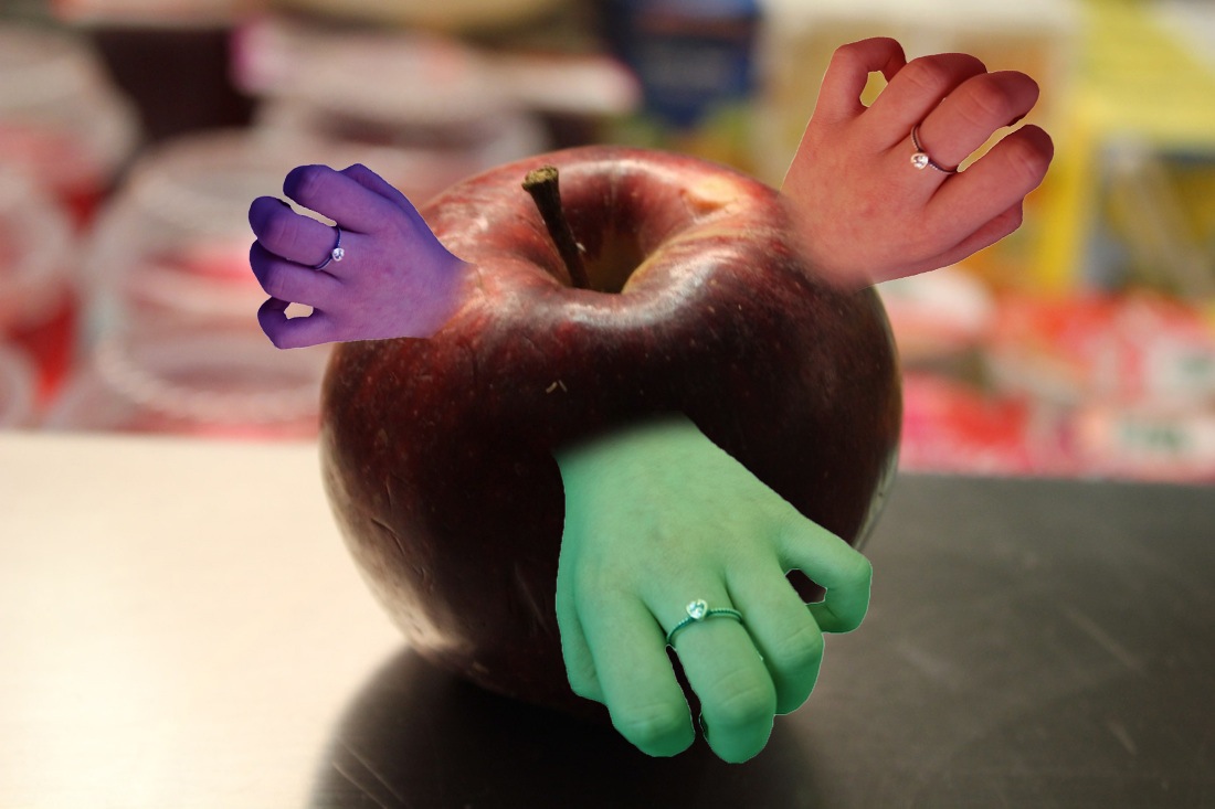
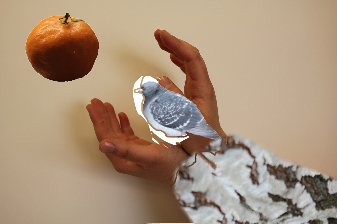
At first, I liked Jerry Uelsmann's work and I took photographs of my hand shapes, foods, the bird, textures and natural world like the trees. I dragged those images into Photoshop and I played around with the images to make it look strange. I also put three or four layers and blended them together. Jerry Uelsmann's images are always Black and White to blurred. He uses a lot of natural forms and shapes. I do like Jerry Uelsmann's style but it is not my type, so I decided to research other artist like Harry Callahan's style, his style is Black and White and he uses people and objects and his work has strong lines and form. I had some negative with me and I made lots of images in the darkroom and experimenting those with double exposure in the darkroom. I changed the edit on images in Photoshop and I don't like this style because I have a feeling that this style don't link to my theme. When I experimented with my images in Harry Callahan's style it was not successful because I felt the images were not interesting.
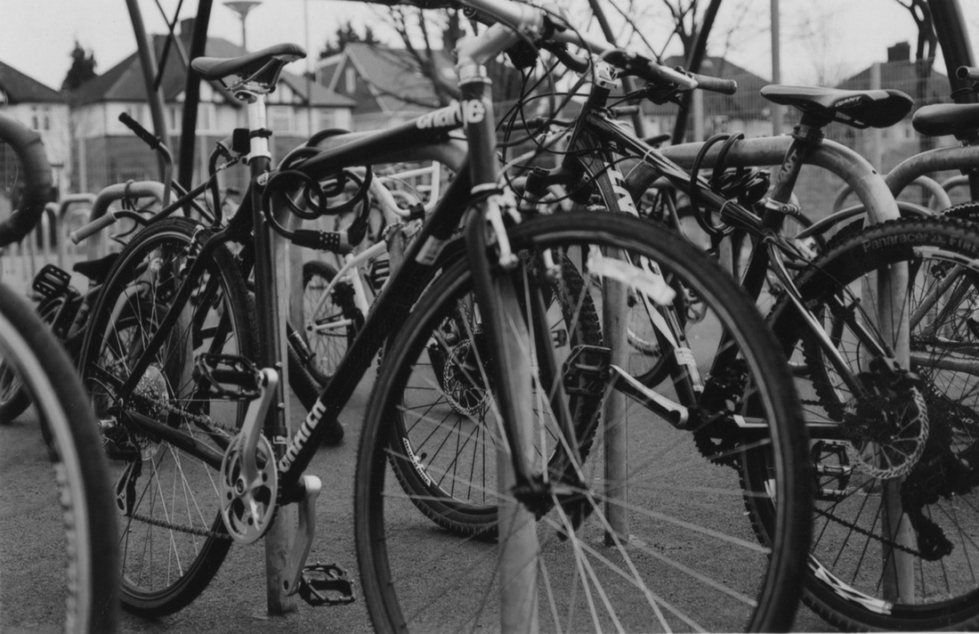
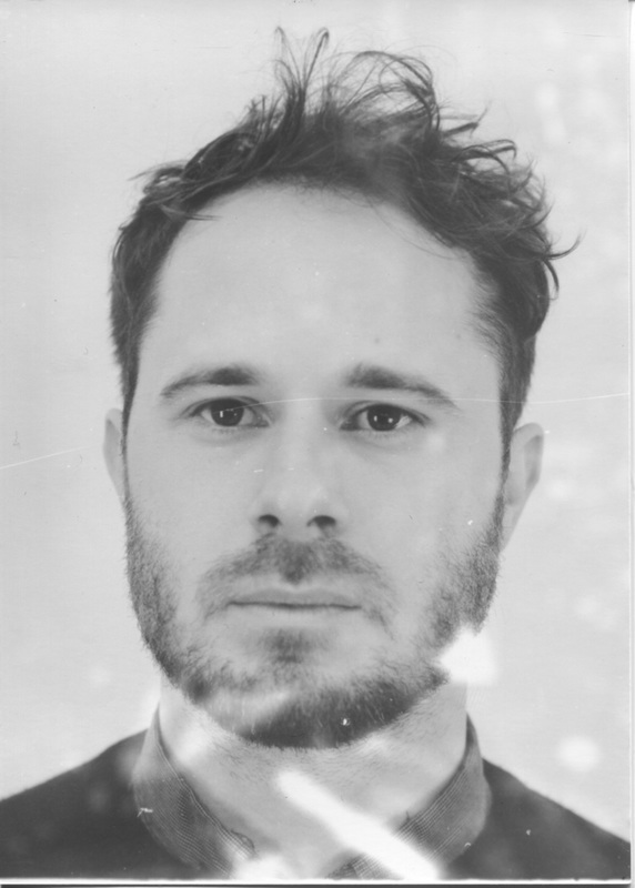
After that, I took 32 black and white film photographs of a man using a Nikon F-301 camera; with zoomed out image, and close up zoomed in images, natural world images like the trees, flowers, plants and things like that, textures on the walls images and the floors, bikes and painted board images. I developed many photographs in the darkroom with two layers on it, a man's face in the centre with a textured background. I finally researched an artist named Timothy Pakron, and I was really interested with his work. I decided to do his style because his images remind me of emotions. The techniques he uses make the person look like they are crying. I think this links to the theme 'Fantastic and Strange' well.
I experiment with two techniques that links to his theme. I painted on the normal paper very dark colour like black and I left them to dry. After the drying, I scanned those painted papers and I made the images in Photoshop with a man inside the painted shape with the background. I used Timothy Pakron's style and used the darkroom to develop my photographs. I picked a man's face closed up image and I dripped the developer chemical on it to give a 'splash' effect on the paper and it ended up looking strange just like my theme. I practiced on many photographic papers and I improved to make the images look strange. I chose the best images I did in the darkroom as my piece of work.
I think I improved my work from the beginning to the end. I experiment with lots of styles and different artists. Finally, I chose Timothy Pakron's style as his is the best because it links to my theme and I really like his style. Also I never seen images like his before so I thought why not experiment with his style and adapt it to suit my theme. I like my final images and I am pleased with the results. The experiment that did not work well was dripping the developer chemical as it changed the colour to Sepia not Black and White. It also look uneven and messy on some images.
At first, I liked Jerry Uelsmann's work and I took photographs of my hand shapes, foods, the bird, textures and natural world like the trees. I dragged those images into Photoshop and I played around with the images to make it look strange. I also put three or four layers and blended them together. Jerry Uelsmann's images are always Black and White to blurred. He uses a lot of natural forms and shapes. I do like Jerry Uelsmann's style but it is not my type, so I decided to research other artist like Harry Callahan's style, his style is Black and White and he uses people and objects and his work has strong lines and form. I had some negative with me and I made lots of images in the darkroom and experimenting those with double exposure in the darkroom. I changed the edit on images in Photoshop and I don't like this style because I have a feeling that this style don't link to my theme. When I experimented with my images in Harry Callahan's style it was not successful because I felt the images were not interesting.
After that, I took 32 black and white film photographs of a man using a Nikon F-301 camera; with zoomed out image, and close up zoomed in images, natural world images like the trees, flowers, plants and things like that, textures on the walls images and the floors, bikes and painted board images. I developed many photographs in the darkroom with two layers on it, a man's face in the centre with a textured background. I finally researched an artist named Timothy Pakron, and I was really interested with his work. I decided to do his style because his images remind me of emotions. The techniques he uses make the person look like they are crying. I think this links to the theme 'Fantastic and Strange' well.
I experiment with two techniques that links to his theme. I painted on the normal paper very dark colour like black and I left them to dry. After the drying, I scanned those painted papers and I made the images in Photoshop with a man inside the painted shape with the background. I used Timothy Pakron's style and used the darkroom to develop my photographs. I picked a man's face closed up image and I dripped the developer chemical on it to give a 'splash' effect on the paper and it ended up looking strange just like my theme. I practiced on many photographic papers and I improved to make the images look strange. I chose the best images I did in the darkroom as my piece of work.
I think I improved my work from the beginning to the end. I experiment with lots of styles and different artists. Finally, I chose Timothy Pakron's style as his is the best because it links to my theme and I really like his style. Also I never seen images like his before so I thought why not experiment with his style and adapt it to suit my theme. I like my final images and I am pleased with the results. The experiment that did not work well was dripping the developer chemical as it changed the colour to Sepia not Black and White. It also look uneven and messy on some images.
